The HTML <input> tag
The HTML <input> element is the all-purpose form control. Its type attribute selects the kind of control: text, email, password, number, checkbox, radio, date, file, range, color and more. It is a void element (no closing tag) and should always be paired with a <label>.
Overview
The <input> element is the most versatile control in HTML: a single void element that becomes a text box, checkbox, radio button, slider, date picker, color picker, file uploader or more, all decided by its type attribute.
The type also brings built-in behavior and validation: email and url check the format, number and range enforce min/max/step, and attributes like required, pattern and maxlength add constraints. On mobile, set inputmode and autocomplete for the right keyboard and autofill.
Every input needs an accessible name, which almost always means an associated <label>. The control's name is what gets submitted with its value.
Syntax
<label for="email">Email</label>
<input id="email" name="email" type="email" required>
Attributes
The <input> element supports the following attributes, in addition to the global attributes available to every HTML element.
| Attribute | Value | Description |
|---|---|---|
accept |
A comma-separated list of file extensions (.jpg), MIME types (image/png), or wildcards (image/*). |
Filters the file types a file input accepts. |
alt |
A short, descriptive string. Use an empty value (alt="") for purely decorative images. |
Provides alternative text for an image. |
autocomplete |
on, off, or a specific token such as email, name, current-password, one-time-code. |
Controls browser autofill for a field. |
capture |
user (front camera) environment (rear camera) |
Requests media capture from a device camera/mic. |
checked |
A boolean attribute: present or absent. | Pre-checks a checkbox or radio button. |
dirname |
A field name to submit the direction under, e.g. comment.dir. |
Submits a field's text direction with the form. |
disabled |
A boolean attribute: present or absent. | Disables a form control. |
formaction |
A URL. | Overrides the form action for one submit button. |
formenctype |
application/x-www-form-urlencoded multipart/form-data text/plain |
Overrides the form encoding for one button. |
formmethod |
get post dialog |
Overrides the form method for one submit button. |
formnovalidate |
A boolean attribute: present or absent. | Skips validation for one submit button. |
formtarget |
_self _blank _parent _top a named context |
Overrides the form target for one button. |
height |
A non-negative integer (pixels). | Sets the height of the element in pixels. |
list |
The id of a <datalist> element. |
Connects an input to a datalist of suggestions. |
max |
A number or date, depending on the control. | Sets the maximum allowed value. |
maxlength |
A non-negative integer. | Limits the maximum character count. |
min |
A number or date, depending on the control. | Sets the minimum allowed value. |
minlength |
A non-negative integer. | Sets the minimum character count. |
multiple |
A boolean attribute: present or absent. | Allows multiple values or selections. |
name |
A string (the field name used in the submitted data). | Names a form control for submission. |
pattern |
A JavaScript regular expression (without delimiters). | Validates input against a regular expression. |
placeholder |
A string of hint text. | Shows hint text in an empty field. |
popovertarget |
The id of an element that has the popover attribute. |
Makes a button toggle a popover. |
popovertargetaction |
toggle (default) show hide |
Sets whether a popover button shows, hides or toggles. |
readonly |
A boolean attribute: present or absent. | Makes a field read-only. |
required |
A boolean attribute: present or absent. | Marks a form control as mandatory. |
size |
A positive integer. | Sets the visible size of the control. |
src |
A URL pointing to the resource. | Specifies the URL of an embedded resource. |
step |
A positive number, or any. |
Sets the value increment for numeric/date inputs. |
type |
text (default) email password number tel url search date time datetime-local month week color range checkbox radio file hidden submit reset button image |
Sets the type of an input control. |
value |
A string or number, depending on the element and input type. | Sets a control's value. |
width |
A non-negative integer (pixels). | Sets the width of the element in pixels. |
Example
<label for="q">Search</label>
<input id="q" name="q" type="search" placeholder="Type to search…" style="padding:8px; width:100%;">
More Examples
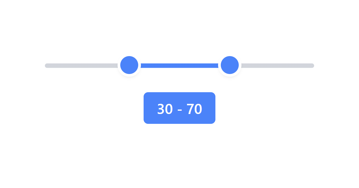

Best practices
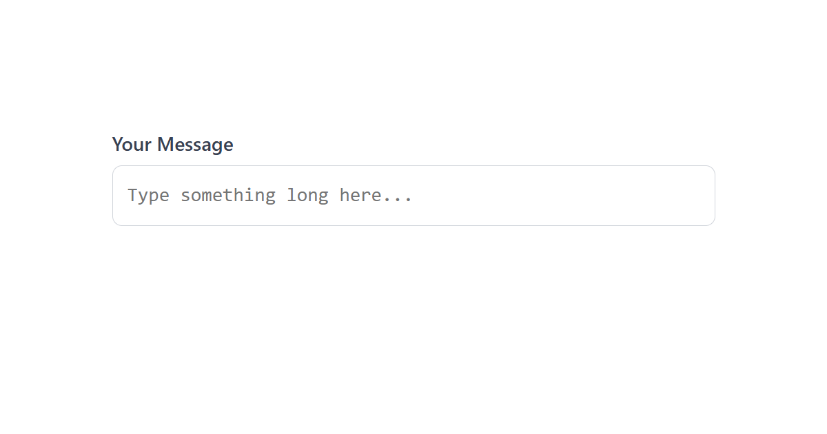
- Always pair an input with a <label>; never rely on placeholder as the label.
- Choose the most specific type for the data, then enhance mobile with inputmode and autocomplete.
- Use native validation attributes (required, min/max, pattern) and validate on the server too.
- Give each input a name so its value is submitted.
- For file uploads, set accept, and use multiple when several files are allowed.
Accessibility
The single most important rule: every input must have a label. A programmatically-associated <label> gives the field its accessible name and makes the label clickable. Beyond that:
- Do not use placeholder text as the only label; it vanishes on input and has poor contrast.
- Convey requirement and errors with required, aria-invalid and aria-describedby, not color alone.
- Group radio buttons and related checkboxes in a <fieldset> with a <legend>.
Frequently asked questions
How many input types are there?
text, email, password, number, tel, url, search, date, time, color, range, checkbox, radio and file.How do I label an input?
Why use inputmode if I set the type?
type="text" for flexible validation and add inputmode="numeric" to summon a number pad on mobile.How do I make a required input?
Is <input> a self-closing element?
How do I get the value of an input in JavaScript?
How do I create a date picker in HTML?
<input type="date"> for the browser's native calendar picker. Related types include datetime-local, time, month and week.






















