What is a CSS button generator?
A button is a small thing with a lot of CSS behind it. Padding, radius, border, background, text treatment, a shadow, a transition, and then the same again for hover, for the moment it's held down, for keyboard focus, and for when it's turned off. Most of that is quick to write and tedious to tune, which is exactly the sort of job a visual editor is good at.
Change anything here and the preview redraws. The preview is running the same CSS that appears in the box below it, so what you see is what you'll get when you paste it.
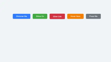
The difference is what the preview shows. Instead of one button you have to hover to inspect, all five states sit side by side, including the focus ring you can never see without tabbing and the disabled state you'd normally have to fake. Underneath, the contrast between the label and the background is measured live against the WCAG AA threshold for that exact size and weight, so a button that reads badly says so before it ships rather than after an audit.
How to Use This Tool
- Start from a style. Solid, pill, outline, ghost, gradient and hard shadow cover the shapes you see on real sites.
- Set the shape and type. Padding, radius, size and weight decide almost all of the character. A wide button with generous padding reads as the main action.
- Pick the reactions. Hover and press are what make a button feel like a button. Darken is the safe choice, lift suits cards, and slide into the shadow belongs with the hard offset look.
- Watch the contrast bar. It goes red the moment the label drops below what WCAG AA asks for at the size and weight you've chosen.
- Copy both boxes. The CSS has the base rule and every state. The HTML is a real
button element rather than a styled div.
Common Use Cases
Buttons carry the weight of an interface, and the different jobs they do want different treatments.
- The main action: one solid, high contrast button per screen. If everything is emphasized, nothing is.
- Secondary actions: the outline or ghost styles, which sit beside the main button without competing with it.
- Destructive actions: the danger preset, ideally paired with a confirmation rather than relying on the color alone.
- Marketing pages: gradient fills and a lift on hover, where the button is meant to draw the eye rather than blend into a toolbar.
- Toolbars and menus: ghost buttons with a hover background, so a row of controls stays quiet until you reach for one.
- Forms: a full width button on mobile, since a thumb finds a wide target far more easily than a small one.
Building the rest of the component? The CSS Box Shadow Generator goes deeper on layered shadows, the CSS Gradient Border Generator handles a gradient edge with rounded corners, and the CSS Loader Generator makes the spinner for the button's busy state. Or browse all our free developer tools.
Frequently Asked Questions
Why does the generated CSS use focus-visible instead of focus?
:focus fires whenever an element receives focus, including on a mouse click, which is why so many sites removed focus outlines. :focus-visible only matches when the browser thinks a visible indicator is warranted, which in practice means keyboard and assistive technology rather than the pointer. So you get a clean click and a clear ring when tabbing. Every current browser supports it.
How is the contrast number worked out?
It's the WCAG relative luminance formula, the same one every accessibility checker uses. The label color is compared against the button's background, and for a gradient it's compared against both stops so the worst case is what gets reported. The threshold moves with the type, so normal text needs 4.5 to 1 and large text needs 3 to 1, where large means 24px or 18.66px when it's bold. For the outline and ghost fills there's no background to measure, so the comparison is against a white page and the bar says so.
Should I use a button element or an anchor?
Use button when clicking does something on the current page, and a when it goes somewhere. That's not pedantry. A link can be opened in a new tab and is announced as a link, a button responds to the space bar and is announced as a button, and getting it backwards breaks both. If you need a link that looks like a button, apply this CSS to an anchor and add display: inline-flex, which it already has.
Why does my button look different in Safari?
Safari applies its own appearance to form controls, so a button can pick up rounded corners, a gradient or an inset shadow you never asked for. The generated CSS overrides border, background and radius explicitly, which handles it. If something still leaks through, add -webkit-appearance: none. The other classic is the font, since buttons don't inherit the page font by default, which is why font-family: inherit is in the output.
Is a disabled button a good idea?
Often not. A disabled button can't be focused, so keyboard users can't reach it to find out why it's off, and screen readers may skip it entirely. It also usually fails contrast because of the reduced opacity. The alternative many teams prefer is to leave the button enabled and explain what's missing when it's pressed. If you do disable it, say why in text next to it rather than relying on the gray.
How small can a button be?
WCAG asks for a target of at least 24 by 24 CSS pixels, and the more comfortable guidance from both Apple and Google is closer to 44 by 44. Padding is what gets you there, so a 16px label with 12px of vertical padding lands at about 44 pixels tall. That's why the padding controls here start where they do.
Can I use this with Tailwind?
Yes, pick the Tailwind option above the code. It gives you an arbitrary-value class for the base styles, and because hover, focus and disabled rules can't become utility classes, they ride along underneath in a style block. For a button you'll reuse, a component class in your stylesheet is usually tidier than a long string of utilities anyway.