In this guide, we shall enhance the capabilities of the native select element with selectable options, search functionality, customizable items, and last but not least, a much better UI design. We'll mimic the native HTML select element and utilize JS classes to provide a user-friendly dropdown box with checkboxes.
The multi-select dropdown JS class will enable users to select multiple options within an elegant dropdown list with additional functions such as searching, selecting all options, and limiting the maximum number of items the user can select. To do that, we can leverage JavaScript, HTML, and CSS3.
One of the advantages of using a preexisting HTML form element is that the class will fall back to the original element if JavaScript is disabled in the user's browser, and therefore, the user can still interact with the form element. Not only that, but the entire class is written in pure JS, so we don't have to include additional libraries such as jQuery — why use jQuery when we can leverage ES6+.
You can view the demo here: https://codeshack.io/multi-select-dropdown-js/
So, without further ado, let's get started!
Contents
1. Stylesheet (CSS3)
The stylesheet will be responsible for our multi-select dropdown element's UI design and structure. We can leverage CSS3 to create a modernized appearance.
Create a new file called MultiSelect.css and add the following CSS code:
:root {
  --spacing-smaller: 0.1875rem;
  --spacing-small: 0.3125rem;
  --spacing-medium: 0.4375rem;
  --spacing-large: 0.75rem;
  --font-size: 0.75rem;
  --font-size-large: 0.875rem;
  --font-size-larger: 1rem;
  --line-height: 1rem;
  --line-height-larger: 1.25rem;
  --primary-color: #40c979;
  --ms-bg: #ffffff;
  --text-color-dark: #212529;
  --text-color: #585858;
  --text-color-light: #65727e;
  --border-color: #bebebe;
  --border-color-light: #f1f3f5;
  --input-placeholder: #65727e;
  --input-background: #e9e9ed;
  --input-border: #dee2e6;
  --input-border-active: #c1c9d0;
  --input-border-invalid: #e44e4e;
  --input-outline-invalid: rgba(219, 138, 138, 0.5);
  --input-color: #e9e9ed;
  --input-disabled: #f7f7f7;
  --option-background: #f3f4f7;
  --checkbox-border: #ced4da;
  --checkbox-background: #ffffff;
  --checkbox-active: #ffffff;
  --input-min-height: 2.8125rem;
  --options-height: 40dvh;
  --border-radius: 0.3125rem;
  --icon-size: 0.75rem;
  --icon-space: 1.875rem;
  --checkbox-size: 1rem;
  --checkbox-radius: 0.25rem;
  --checkbox-thickness: 0.125rem;
}
.multi-select[data-theme="dark"] {
  --ms-bg: #2b2b2b;
  --text-color-dark: #f8f9fa;
  --text-color: #adb5bd;
  --text-color-light: #adb5bd;
  --border-color: #495057;
  --border-color-light: #495057;
  --input-background: #343a40;
  --input-border: #495057;
  --input-border-active: #6c757d;
  --option-background: #343a40;
  --checkbox-background: #2b2b2b;
  --checkbox-border: #6c757d;
  --checkbox-active: #ffffff;
  --input-disabled: #1e1e1e;
}
@media (prefers-color-scheme: dark) {
  .multi-select[data-theme="auto"] {
    --ms-bg: #2b2b2b;
    --text-color-dark: #f8f9fa;
    --text-color: #adb5bd;
    --text-color-light: #adb5bd;
    --border-color: #495057;
    --border-color-light: #495057;
    --input-background: #343a40;
    --input-border: #495057;
    --input-border-active: #6c757d;
    --option-background: #343a40;
    --checkbox-background: #2b2b2b;
    --checkbox-border: #6c757d;
    --checkbox-active: #ffffff;
    --input-disabled: #1e1e1e;
  }
}
.multi-select {
  display: flex;
  box-sizing: border-box;
  flex-direction: column;
  position: relative;
  width: 100%;
  user-select: none;
}
.multi-select .multi-select-header {
  background-color: var(--ms-bg);
  border: 1px solid var(--input-border);
  border-radius: var(--border-radius);
  padding: var(--spacing-medium) var(--spacing-large);
  padding-right: var(--icon-space);
  overflow: hidden;
  gap: var(--spacing-medium);
  min-height: var(--input-min-height);
}
.multi-select .multi-select-header::after {
  content: "";
  display: block;
  position: absolute;
  top: 50%;
  right: 1rem;
  transform: translateY(-50%);
  background-image: url("data:image/svg+xml,%3Csvg xmlns='http://www.w3.org/2000/svg' fill='%23949ba3' viewBox='0 0 16 16'%3E%3Cpath d='M8 13.1l-8-8 2.1-2.2 5.9 5.9 5.9-5.9 2.1 2.2z'/%3E%3C/svg%3E");
  height: var(--icon-size);
  width: var(--icon-size);
}
.multi-select .multi-select-header.multi-select-header-active {
  border-color: var(--input-border-active);
}
.multi-select .multi-select-header.multi-select-header-active::after {
  transform: translateY(-50%) rotate(180deg);
}
.multi-select .multi-select-header.multi-select-header-active + .multi-select-options {
  display: flex;
}
.multi-select .multi-select-header .multi-select-header-placeholder {
  color: var(--text-color-light);
}
.multi-select .multi-select-header .multi-select-header-option {
  display: inline-flex;
  align-items: center;
  background-color: var(--option-background);
  color: var(--text-color-dark);
  font-size: var(--font-size-large);
  padding: var(--spacing-smaller) var(--spacing-small);
  border-radius: var(--border-radius);
}
.multi-select .multi-select-header .multi-select-header-max {
  font-size: var(--font-size-large);
  color: var(--text-color-light);
}
.multi-select .multi-select-options {
  display: none;
  box-sizing: border-box;
  flex-flow: wrap;
  position: absolute;
  top: 100%;
  left: 0;
  right: 0;
  z-index: 999;
  margin-top: var(--spacing-small);
  padding: var(--spacing-small);
  background-color: var(--ms-bg);
  border-radius: var(--border-radius);
  box-shadow: 0 0.25rem 0.5rem rgba(0, 0, 0, 0.15);
  max-height: var(--options-height);
  overflow-y: auto;
  overflow-x: hidden;
}
.multi-select .multi-select-options::-webkit-scrollbar {
  width: 0.3125rem;
}
.multi-select .multi-select-options::-webkit-scrollbar-track {
  background: var(--input-background);
}
.multi-select .multi-select-options::-webkit-scrollbar-thumb {
  background: var(--border-color);
}
.multi-select .multi-select-options::-webkit-scrollbar-thumb:hover {
  background: var(--input-placeholder);
}
.multi-select .multi-select-options .multi-select-option,
.multi-select .multi-select-options .multi-select-all,
.multi-select .multi-select-options .multi-select-group {
  padding: 0.5rem var(--spacing-large);
}
.multi-select .multi-select-options .multi-select-option[data-group]:not([data-group=""]) {
  padding-left: 2.5rem;
}
.multi-select .multi-select-options .multi-select-option .multi-select-option-radio,
.multi-select .multi-select-options .multi-select-all .multi-select-option-radio,
.multi-select .multi-select-options .multi-select-group .multi-select-option-radio {
  background: var(--checkbox-background);
  margin-right: var(--spacing-large);
  height: var(--checkbox-size);
  width: var(--checkbox-size);
  border: 1px solid var(--checkbox-border);
  border-radius: var(--checkbox-radius);
}
.multi-select .multi-select-options .multi-select-option .multi-select-option-text,
.multi-select .multi-select-options .multi-select-all .multi-select-option-text,
.multi-select .multi-select-options .multi-select-group .multi-select-option-text {
  box-sizing: border-box;
  flex: 1;
  overflow: hidden;
  text-overflow: ellipsis;
  white-space: nowrap;
  color: inherit;
  font-size: var(--font-size-larger);
  line-height: var(--line-height-larger);
  padding-bottom: 1px;
}
.multi-select .multi-select-options .multi-select-option.multi-select-selected .multi-select-option-radio,
.multi-select .multi-select-options .multi-select-all.multi-select-selected .multi-select-option-radio,
.multi-select .multi-select-options .multi-select-group.multi-select-selected .multi-select-option-radio {
  border-color: var(--primary-color);
  background-color: var(--primary-color);
}
.multi-select .multi-select-options .multi-select-option.multi-select-selected .multi-select-option-radio::after,
.multi-select .multi-select-options .multi-select-all.multi-select-selected .multi-select-option-radio::after,
.multi-select .multi-select-options .multi-select-group.multi-select-selected .multi-select-option-radio::after {
  content: "";
  display: block;
  width: calc(var(--checkbox-size) / 4);
  height: calc(var(--checkbox-size) / 2);
  border: solid var(--checkbox-active);
  border-width: 0 var(--checkbox-thickness) var(--checkbox-thickness) 0;
  transform: rotate(45deg) translate(50%, -25%);
}
.multi-select .multi-select-options .multi-select-option.multi-select-selected .multi-select-option-text,
.multi-select .multi-select-options .multi-select-all.multi-select-selected .multi-select-option-text,
.multi-select .multi-select-options .multi-select-group.multi-select-selected .multi-select-option-text {
  color: var(--text-color-dark);
}
.multi-select .multi-select-options .multi-select-option:hover,
.multi-select .multi-select-options .multi-select-option:active,
.multi-select .multi-select-options .multi-select-all:hover,
.multi-select .multi-select-options .multi-select-all:active,
.multi-select .multi-select-options .multi-select-group:hover,
.multi-select .multi-select-options .multi-select-group:active {
  background-color: var(--option-background);
}
.multi-select .multi-select-options .multi-select-all {
  border-bottom: 1px solid var(--border-color-light);
  border-radius: 0;
}
.multi-select .multi-select-options .multi-select-group {
  font-weight: bold;
  border-radius: 0;
}
.multi-select .multi-select-options .multi-select-search {
  padding: var(--spacing-medium) var(--spacing-large);
  border: 1px solid var(--input-border);
  border-radius: var(--border-radius);
  margin: 0.625rem;
  width: calc(100% - 1.25rem);
  outline: none;
  font-size: var(--font-size-larger);
  background-color: var(--ms-bg);
  color: var(--text-color-dark);
}
.multi-select .multi-select-options .multi-select-search::placeholder {
  color: var(--text-color-light);
}
.multi-select .multi-select-header,
.multi-select .multi-select-option,
.multi-select .multi-select-all,
.multi-select .multi-select-group {
  display: flex;
  flex-wrap: wrap;
  box-sizing: border-box;
  align-items: center;
  border-radius: var(--border-radius);
  cursor: pointer;
  display: flex;
  align-items: center;
  width: 100%;
  font-size: var(--font-size-larger);
  color: var(--text-color-dark);
}
.multi-select.disabled {
  opacity: 0.6;
  pointer-events: none;
  background-color: var(--input-disabled);
}
.multi-select.multi-select-invalid .multi-select-header {
  border-color: var(--input-border-invalid);
  outline: var(--input-outline-invalid) solid 1px;
}
That's essentially all we need to present our multi-select dropdown element. You're welcome to customize the properties, such as the border color, font size, etc, to reflect your site's design.
We can include the stylesheet in our <head> section with the following tag:
<link href="MultiSelect.css" rel="stylesheet" type="text/css">But we'll get more on that later in the examples section.
2. JavaScript Class
The JavaScript class includes a bunch of methods that replace the native select element with a much more customizable one. In addition to that, we can bind event handlers, configure options, and specify data while creating a new instance of the class.
Create a new file called MultiSelect.js and add the following code:
/*
* Created by David Adams
* https://codeshack.io/multi-select-dropdown-html-javascript/
*
* Released under the MIT license
*/
class MultiSelect {
constructor(element, options = {}) {
let defaults = {
placeholder: 'Select item(s)',
max: null,
min: null,
disabled: false,
search: true,
selectAll: true,
listAll: true,
closeListOnItemSelect: false,
name: '',
width: '',
height: '',
dropdownWidth: '',
dropdownHeight: '',
theme: 'auto',
required: false,
data:[],
onChange: function() {},
onSelect: function() {},
onUnselect: function() {},
onMaxReached: function() {}
};
this.options = Object.assign(defaults, options);
this.selectElement = typeof element === 'string' ? document.querySelector(element) : element;
if (this.selectElement._multiSelect) {
this.selectElement._multiSelect.destroy();
}
this.selectElement._multiSelect = this;
this.originalStyle = this.selectElement.getAttribute('style') || '';
this.originalTabIndex = this.selectElement.getAttribute('tabindex');
this._isBatching = false;
for(const prop in this.selectElement.dataset) {
if (this.options[prop] !== undefined) {
if (typeof this.options[prop] === 'boolean' || this.selectElement.dataset[prop] === 'true' || this.selectElement.dataset[prop] === 'false') {
this.options[prop] = this.selectElement.dataset[prop] === 'true';
} else {
this.options[prop] = this.selectElement.dataset[prop];
}
}
}
if (this.selectElement.hasAttribute('required')) this.options.required = true;
if (this.selectElement.hasAttribute('disabled')) this.options.disabled = true;
this.name = this.selectElement.getAttribute('name') ? this.selectElement.getAttribute('name') : 'multi-select-' + Math.floor(Math.random() * 1000000);
if (!this.options.data.length) {
let options = this.selectElement.querySelectorAll('option');
for (let i = 0; i < options.length; i++) {
let parent = options[i].parentElement;
let group = parent.tagName.toLowerCase() === 'optgroup' ? parent.getAttribute('label') : '';
this.options.data.push({
value: options[i].value,
text: options[i].textContent,
selected: options[i].selected,
disabled: options[i].disabled,
html: options[i].getAttribute('data-html'),
group: group
});
}
}
this.originalData = JSON.parse(JSON.stringify(this.options.data));
this.element = this._template();
this.selectElement.insertAdjacentElement('beforebegin', this.element);
this.element.appendChild(this.selectElement);
this.selectElement.multiple = true;
this.selectElement.setAttribute('tabindex', '-1');
this.selectElement.style.position = 'absolute';
this.selectElement.style.left = '0';
this.selectElement.style.top = '0';
this.selectElement.style.width = '100%';
this.selectElement.style.height = '100%';
this.selectElement.style.opacity = '0';
this.selectElement.style.zIndex = '-1';
this.selectElement.style.pointerEvents = 'none';
this.outsideClickHandler = this._outsideClick.bind(this);
this._buildOriginalSelect();
this._updateSelected();
this._eventHandlers();
if (this.options.disabled) this.disable();
if (this.selectElement.form) {
this.formResetHandler = () => setTimeout(() => this.reset(), 0);
this.selectElement.form.addEventListener('reset', this.formResetHandler);
}
}
_escapeHTML(str) {
return str !== undefined && str !== null ? str.toString().replace(/[&<>'"]/g, tag => ({ '&': '&', '<': '<', '>': '>', "'": ''', '"': '"' }[tag] || tag)) : '';
}
_template() {
let optionsHTML = '';
let groupedData = {};
this.data.forEach(item => {
let g = item.group || '';
if(!groupedData[g]) groupedData[g] =[];
groupedData[g].push(item);
});
for (const[groupName, items] of Object.entries(groupedData)) {
if (groupName) {
let enabledItems = items.filter(i => !i.disabled);
let allGroupSelected = enabledItems.length > 0 && enabledItems.every(i => i.selected);
optionsHTML += `
<div class="multi-select-group${allGroupSelected ? ' multi-select-selected' : ''}" data-group="${this._escapeHTML(groupName)}" role="option" tabindex="-1">
<span class="multi-select-option-radio"></span>
<span class="multi-select-option-text">${this._escapeHTML(groupName)}</span>
</div>
`;
}
items.forEach(item => {
const isSelected = item.selected;
const isDisabled = item.disabled;
optionsHTML += `
<div class="multi-select-option${isSelected ? ' multi-select-selected' : ''}" data-value="${this._escapeHTML(item.value)}" data-group="${this._escapeHTML(groupName)}" role="option" aria-selected="${isSelected}" tabindex="-1" ${isDisabled ? 'style="opacity: 0.5; pointer-events: none;"' : ''}>
<span class="multi-select-option-radio"></span>
<span class="multi-select-option-text">${item.html ? item.html : this._escapeHTML(item.text)}</span>
</div>
`;
});
}
let selectAllHTML = '';
if (this.options.selectAll) {
let enabledData = this.data.filter(d => !d.disabled);
let allSelected = enabledData.length > 0 && enabledData.every(d => d.selected);
selectAllHTML = `<div class="multi-select-all${allSelected ? ' multi-select-selected' : ''}" role="option" tabindex="-1">
<span class="multi-select-option-radio"></span>
<span class="multi-select-option-text">Select all</span>
</div>`;
}
let template = `
<div class="multi-select ${this.name}"${this.selectElement.id ? ' id="ms-' + this._escapeHTML(this.selectElement.id) + '"' : ''} style="${this.width ? 'width:' + this.width + ';' : ''}${this.height ? 'height:' + this.height + ';' : ''}" role="combobox" aria-haspopup="listbox" aria-expanded="false" data-theme="${this.options.theme}">
<div class="multi-select-header" style="${this.width ? 'width:' + this.width + ';' : ''}${this.height ? 'height:' + this.height + ';' : ''}" tabindex="0">
<span class="multi-select-header-max">${this.options.max ? this.selectedValues.length + '/' + this.options.max : ''}</span>
<span class="multi-select-header-placeholder">${this._escapeHTML(this.placeholder)}</span>
</div>
<div class="multi-select-options" style="${this.options.dropdownWidth ? 'width:' + this.options.dropdownWidth + ';' : ''}${this.options.dropdownHeight ? 'height:' + this.options.dropdownHeight + ';' : ''}" role="listbox">
${this.options.search ? '<input type="text" class="multi-select-search" placeholder="Search..." role="searchbox">' : ''}
${selectAllHTML}
${optionsHTML}
</div>
</div>
`;
let element = document.createElement('div');
element.innerHTML = template;
return element.firstElementChild;
}
_eventHandlers() {
let headerElement = this.element.querySelector('.multi-select-header');
const toggleDropdown = (forceClose = false) => {
if (this.element.classList.contains('disabled')) return;
if (forceClose || headerElement.classList.contains('multi-select-header-active')) {
headerElement.classList.remove('multi-select-header-active');
this.element.setAttribute('aria-expanded', 'false');
} else {
headerElement.classList.add('multi-select-header-active');
this.element.setAttribute('aria-expanded', 'true');
}
};
this.element.querySelectorAll('.multi-select-option').forEach(option => {
option.onclick = (e) => {
e.stopPropagation();
if (this.element.classList.contains('disabled')) return;
let dataItem = this.data.find(d => String(d.value) === String(option.dataset.value));
if (!dataItem || dataItem.disabled) return;
let selected = true;
if (!option.classList.contains('multi-select-selected')) {
if (this.options.max && this.selectedValues.length >= this.options.max) {
if (!this._isBatching) this.options.onMaxReached(this.options.max);
return;
}
option.classList.add('multi-select-selected');
option.setAttribute('aria-selected', 'true');
dataItem.selected = true;
} else {
option.classList.remove('multi-select-selected');
option.setAttribute('aria-selected', 'false');
dataItem.selected = false;
selected = false;
}
if (!this._isBatching) {
this._updateSelected();
this._syncOriginalSelect();
if (this.options.closeListOnItemSelect) {
if (this.options.search) {
this.element.querySelector('.multi-select-search').value = '';
this.element.querySelectorAll('.multi-select-option, .multi-select-group').forEach(opt => opt.style.display = 'flex');
}
toggleDropdown(true);
}
}
this.options.onChange(option.dataset.value, option.querySelector('.multi-select-option-text').innerHTML, option);
if (selected) {
this.options.onSelect(option.dataset.value, option.querySelector('.multi-select-option-text').innerHTML, option);
} else {
this.options.onUnselect(option.dataset.value, option.querySelector('.multi-select-option-text').innerHTML, option);
}
};
});
this.element.querySelectorAll('.multi-select-group').forEach(groupEl => {
groupEl.onclick = (e) => {
e.stopPropagation();
if (this.element.classList.contains('disabled')) return;
let groupName = groupEl.dataset.group;
let isSelected = groupEl.classList.contains('multi-select-selected');
let hitMax = false;
this._isBatching = true;
this.element.querySelectorAll('.multi-select-option').forEach(option => {
if (option.dataset.group === groupName && option.style.display !== 'none') {
let dataItem = this.data.find(d => String(d.value) === String(option.dataset.value));
if (dataItem && !dataItem.disabled && ((!isSelected && !dataItem.selected) || (isSelected && dataItem.selected))) {
if (this.options.max && this.selectedValues.length >= this.options.max && !isSelected) {
hitMax = true;
return;
}
option.click();
}
}
});
this._isBatching = false;
this._updateSelected();
this._syncOriginalSelect();
if (this.options.closeListOnItemSelect) {
if (this.options.search) {
this.element.querySelector('.multi-select-search').value = '';
this.element.querySelectorAll('.multi-select-option, .multi-select-group').forEach(opt => opt.style.display = 'flex');
}
toggleDropdown(true);
}
if (hitMax) this.options.onMaxReached(this.options.max);
};
});
headerElement.onclick = () => toggleDropdown();
if (this.options.search) {
let search = this.element.querySelector('.multi-select-search');
search.oninput = () => {
let searchValue = search.value.toLowerCase();
let visibleGroups = new Set();
this.element.querySelectorAll('.multi-select-option').forEach(option => {
const text = option.querySelector('.multi-select-option-text').textContent.toLowerCase();
if (text.includes(searchValue)) {
option.style.display = 'flex';
if (option.dataset.group) visibleGroups.add(option.dataset.group);
} else {
option.style.display = 'none';
}
});
this.element.querySelectorAll('.multi-select-group').forEach(group => {
if (visibleGroups.has(group.dataset.group) || group.querySelector('.multi-select-option-text').textContent.toLowerCase().includes(searchValue)) {
group.style.display = 'flex';
if (group.querySelector('.multi-select-option-text').textContent.toLowerCase().includes(searchValue)) {
this.element.querySelectorAll('.multi-select-option').forEach(opt => {
if (opt.dataset.group === group.dataset.group) opt.style.display = 'flex';
});
}
} else {
group.style.display = 'none';
}
});
};
}
if (this.options.selectAll) {
let selectAllButton = this.element.querySelector('.multi-select-all');
selectAllButton.onclick = (e) => {
e.stopPropagation();
if (this.element.classList.contains('disabled')) return;
let isSelected = selectAllButton.classList.contains('multi-select-selected');
let hitMax = false;
this._isBatching = true;
this.element.querySelectorAll('.multi-select-option').forEach(option => {
if (option.style.display !== 'none') {
let dataItem = this.data.find(d => String(d.value) === String(option.dataset.value));
if (dataItem && !dataItem.disabled && ((!isSelected && !dataItem.selected) || (isSelected && dataItem.selected))) {
if (this.options.max && this.selectedValues.length >= this.options.max && !isSelected) {
hitMax = true;
return;
}
option.click();
}
}
});
this._isBatching = false;
this._updateSelected();
this._syncOriginalSelect();
if (this.options.closeListOnItemSelect) {
if (this.options.search) {
this.element.querySelector('.multi-select-search').value = '';
this.element.querySelectorAll('.multi-select-option, .multi-select-group').forEach(opt => opt.style.display = 'flex');
}
toggleDropdown(true);
}
if (hitMax) this.options.onMaxReached(this.options.max);
};
}
if (this.selectElement.id) {
if (this.labelClickHandler) {
document.querySelectorAll(`label[for="${CSS.escape(this.selectElement.id)}"]`).forEach(label => {
label.removeEventListener('click', this.labelClickHandler);
});
}
this.labelClickHandler = (e) => {
e.preventDefault();
toggleDropdown();
headerElement.focus();
};
document.querySelectorAll(`label[for="${CSS.escape(this.selectElement.id)}"]`).forEach(label => {
label.addEventListener('click', this.labelClickHandler);
});
}
this.element.addEventListener('focusout', (e) => {
if (!this.element.contains(e.relatedTarget)) {
if (headerElement.classList.contains('multi-select-header-active')) {
headerElement.classList.remove('multi-select-header-active');
this.element.setAttribute('aria-expanded', 'false');
}
}
});
document.addEventListener('click', this.outsideClickHandler);
headerElement.addEventListener('keydown', (e) => {
if (['Enter', ' ', 'ArrowDown', 'ArrowUp'].includes(e.key)) {
e.preventDefault();
toggleDropdown();
const firstElement = this.element.querySelector('[role="searchbox"]') || this.element.querySelector('[role="option"]');
if (firstElement) firstElement.focus();
}
});
this.element.addEventListener('keydown', (e) => {
if (e.key === 'Escape') {
toggleDropdown(true);
headerElement.focus();
}
});
const optionsContainer = this.element.querySelector('.multi-select-options');
optionsContainer.addEventListener('keydown', (e) => {
const currentFocused = document.activeElement;
if (currentFocused.closest('.multi-select-options')) {
if (['ArrowDown', 'ArrowUp'].includes(e.key)) {
e.preventDefault();
const direction = e.key === 'ArrowDown' ? 'nextElementSibling' : 'previousElementSibling';
let nextElement = currentFocused[direction];
while (nextElement && (nextElement.style.display === 'none' || nextElement.style.pointerEvents === 'none' || !nextElement.matches('[role="option"],[role="searchbox"]'))) {
nextElement = nextElement[direction];
}
if (nextElement) nextElement.focus();
} else if (e.key === 'Enter') {
if (currentFocused.matches('[role="searchbox"]')) {
e.preventDefault();
} else if (currentFocused.matches('[role="option"]')) {
e.preventDefault();
currentFocused.click();
}
} else if (e.key === ' ' && currentFocused.matches('[role="option"]')) {
e.preventDefault();
currentFocused.click();
}
}
});
}
_updateHeader() {
this.element.querySelectorAll('.multi-select-header-option, .multi-select-header-placeholder').forEach(el => el.remove());
if (this.selectedValues.length > 0) {
if (this.options.listAll) {
this.selectedItems.forEach(item => {
const el = document.createElement('span');
el.className = 'multi-select-header-option';
el.dataset.value = item.value;
el.innerHTML = item.html ? item.html : this._escapeHTML(item.text);
this.element.querySelector('.multi-select-header').prepend(el);
});
} else {
this.element.querySelector('.multi-select-header').insertAdjacentHTML('afterbegin', `<span class="multi-select-header-option">${this.selectedValues.length} selected</span>`);
}
} else {
this.element.querySelector('.multi-select-header').insertAdjacentHTML('beforeend', `<span class="multi-select-header-placeholder">${this._escapeHTML(this.placeholder)}</span>`);
}
if (this.options.max) {
this.element.querySelector('.multi-select-header-max').innerHTML = this.selectedValues.length + '/' + this.options.max;
}
}
_updateSelectAll() {
if (!this.options.selectAll) return;
const selectAllBtn = this.element.querySelector('.multi-select-all');
if (selectAllBtn) {
const enabledData = this.data.filter(d => !d.disabled);
const allSelected = enabledData.length > 0 && enabledData.every(d => d.selected);
if (allSelected) selectAllBtn.classList.add('multi-select-selected');
else selectAllBtn.classList.remove('multi-select-selected');
}
}
_updateGroups() {
this.element.querySelectorAll('.multi-select-group').forEach(groupEl => {
const groupName = groupEl.dataset.group;
const enabledItems = this.data.filter(d => d.group === groupName && !d.disabled);
if (enabledItems.length > 0 && enabledItems.every(d => d.selected)) {
groupEl.classList.add('multi-select-selected');
} else {
groupEl.classList.remove('multi-select-selected');
}
});
}
_updateSelected() {
this._updateHeader();
this._updateSelectAll();
this._updateGroups();
this._validate();
}
_validate() {
let isValid = true;
if (this.options.required) isValid = this.selectedValues.length > 0;
if (this.options.min && this.selectedValues.length < this.options.min) isValid = false;
if (!isValid) {
this.element.classList.add('multi-select-invalid');
if (this.selectElement && this.options.required) this.selectElement.setCustomValidity('Please fill out this field.');
} else {
this.element.classList.remove('multi-select-invalid');
if (this.selectElement) this.selectElement.setCustomValidity('');
}
}
_buildOriginalSelect() {
if (!this.selectElement) return;
this.selectElement.innerHTML = '';
let groupedData = {};
this.data.forEach(item => {
let g = item.group || '';
if(!groupedData[g]) groupedData[g] =[];
groupedData[g].push(item);
});
for (const[groupName, items] of Object.entries(groupedData)) {
let parent = this.selectElement;
if (groupName) {
let optgroup = document.createElement('optgroup');
optgroup.label = groupName;
this.selectElement.appendChild(optgroup);
parent = optgroup;
}
items.forEach(item => {
let opt = document.createElement('option');
opt.value = item.value;
opt.textContent = item.text !== undefined && item.text !== null ? item.text : (item.html ? item.html.replace(/<[^>]*>?/gm, '') : '');
opt.selected = item.selected;
opt.disabled = item.disabled || false;
if(item.html) opt.setAttribute('data-html', item.html);
parent.appendChild(opt);
});
}
}
_syncOriginalSelect() {
if (!this.selectElement) return;
let changed = false;
for (let option of this.selectElement.options) {
let dataItem = this.data.find(d => String(d.value) === String(option.value));
if (dataItem && option.selected !== dataItem.selected) {
option.selected = dataItem.selected;
changed = true;
}
}
if (changed) {
this.selectElement.dispatchEvent(new Event('change', { bubbles: true }));
}
}
_outsideClick(event) {
if (!this.selectElement.isConnected) {
document.removeEventListener('click', this.outsideClickHandler);
return;
}
const labelSelector = this.selectElement.id ? `label[for="${CSS.escape(this.selectElement.id)}"]` : null;
const clickedOnLabel = labelSelector ? event.target.closest(labelSelector) : false;
if (!this.element.contains(event.target) && !clickedOnLabel) {
let headerElement = this.element.querySelector('.multi-select-header');
if (headerElement.classList.contains('multi-select-header-active')) {
headerElement.classList.remove('multi-select-header-active');
this.element.setAttribute('aria-expanded', 'false');
}
}
}
select(value) {
const option = Array.from(this.element.querySelectorAll('.multi-select-option')).find(el => String(el.dataset.value) === String(value));
if (option && !option.classList.contains('multi-select-selected')) option.click();
}
unselect(value) {
const option = Array.from(this.element.querySelectorAll('.multi-select-option')).find(el => String(el.dataset.value) === String(value));
if (option && option.classList.contains('multi-select-selected')) option.click();
}
setValues(values) {
const valArray = Array.isArray(values) ? values :[values];
const stringValues = valArray.map(String);
let changed = false;
this.data.forEach(item => {
const isSelected = stringValues.includes(String(item.value));
if (item.selected !== isSelected && !item.disabled) {
item.selected = isSelected;
changed = true;
}
});
if (changed) {
this.refresh();
this.selectElement.dispatchEvent(new Event('change', { bubbles: true }));
}
}
disable() {
this.options.disabled = true;
this.element.classList.add('disabled');
this.element.querySelector('.multi-select-header').removeAttribute('tabindex');
const searchInput = this.element.querySelector('.multi-select-search');
if (searchInput) searchInput.disabled = true;
if (this.selectElement) this.selectElement.disabled = true;
let headerElement = this.element.querySelector('.multi-select-header');
if (headerElement && headerElement.classList.contains('multi-select-header-active')) {
headerElement.classList.remove('multi-select-header-active');
this.element.setAttribute('aria-expanded', 'false');
}
}
enable() {
this.options.disabled = false;
this.element.classList.remove('disabled');
this.element.querySelector('.multi-select-header').setAttribute('tabindex', '0');
const searchInput = this.element.querySelector('.multi-select-search');
if (searchInput) searchInput.disabled = false;
if (this.selectElement) this.selectElement.disabled = false;
}
destroy() {
this.element.insertAdjacentElement('beforebegin', this.selectElement);
this.element.remove();
if (this.originalStyle) {
this.selectElement.setAttribute('style', this.originalStyle);
} else {
this.selectElement.removeAttribute('style');
}
if (this.originalTabIndex !== null) {
this.selectElement.setAttribute('tabindex', this.originalTabIndex);
} else {
this.selectElement.removeAttribute('tabindex');
}
if (this.selectElement.form && this.formResetHandler) {
this.selectElement.form.removeEventListener('reset', this.formResetHandler);
}
if (this.selectElement.id && this.labelClickHandler) {
document.querySelectorAll(`label[for="${CSS.escape(this.selectElement.id)}"]`).forEach(label => {
label.removeEventListener('click', this.labelClickHandler);
});
}
document.removeEventListener('click', this.outsideClickHandler);
delete this.selectElement._multiSelect;
}
refresh() {
this.element.insertAdjacentElement('beforebegin', this.selectElement);
const newElement = this._template();
this.element.replaceWith(newElement);
this.element = newElement;
this.element.appendChild(this.selectElement);
this._buildOriginalSelect();
this._updateSelected();
this._eventHandlers();
}
addItem(item) {
this.options.data.push(item);
this.originalData.push(JSON.parse(JSON.stringify(item)));
this.refresh();
}
addItems(items) {
this.options.data.push(...items);
this.originalData.push(...JSON.parse(JSON.stringify(items)));
this.refresh();
}
async fetch(url, options = {}) {
try {
const response = await window.fetch(url, options);
if (!response.ok) throw new Error('Network response was not ok');
const data = await response.json();
this.addItems(data);
if (this.options.onload) {
this.options.onload(data, this.options);
}
} catch (error) {
console.error('MultiSelect Fetch Error:', error);
}
}
removeItem(value) {
this.options.data = this.options.data.filter(item => String(item.value) !== String(value));
this.originalData = this.originalData.filter(item => String(item.value) !== String(value));
this.refresh();
}
clear() {
this.options.data =[];
this.refresh();
this.selectElement.dispatchEvent(new Event('change', { bubbles: true }));
}
deselectAll() {
let changed = false;
this.data.forEach(item => {
if (item.selected && !item.disabled) {
item.selected = false;
changed = true;
}
});
if (changed) {
this.refresh();
this.selectElement.dispatchEvent(new Event('change', { bubbles: true }));
}
}
reset() {
this.data = JSON.parse(JSON.stringify(this.originalData));
this.refresh();
this.selectElement.dispatchEvent(new Event('change', { bubbles: true }));
}
selectAll() {
let changed = false;
this.data.forEach(item => {
if (!item.selected && !item.disabled) {
item.selected = true;
changed = true;
}
});
if (changed) {
this.refresh();
this.selectElement.dispatchEvent(new Event('change', { bubbles: true }));
}
}
get selectedValues() { return this.data.filter(d => d.selected).map(d => d.value); }
get selectedItems() { return this.data.filter(d => d.selected); }
get data() { return this.options.data; }
set data(value) { this.options.data = value; }
set selectElement(value) { this.options.selectElement = value; }
get selectElement() { return this.options.selectElement; }
set element(value) { this.options.element = value; }
get element() { return this.options.element; }
set placeholder(value) { this.options.placeholder = value; }
get placeholder() { return this.options.placeholder; }
set name(value) { this.options.name = value; }
get name() { return this.options.name; }
set width(value) { this.options.width = value; }
get width() { return this.options.width; }
set height(value) { this.options.height = value; }
get height() { return this.options.height; }
}
document.querySelectorAll('[data-multi-select]').forEach(select => new MultiSelect(select));The code will automatically create a new instance of the class if the data-multi-select attribute is specified on one or more select elements, meaning all we essentially have to do is include the JS file in our HTML document with:
<script src="MultiSelect.js"></script>Preferably at the bottom of the document before the body closing tag.
However, if we want to customize it further with custom HTML, etc, we can dynamically create a new instance and include additional options. It's pretty straightforward, so you shouldn't encounter any issues getting started!
3. Examples
In this section, we'll cover practical examples that will help guide you into integrating the multi-select dropdown element in your own projects.
3.1. Simple Dropdown
Let's start with a simple dropdown element with minimal configuration.
Add the following code to your HTML document:
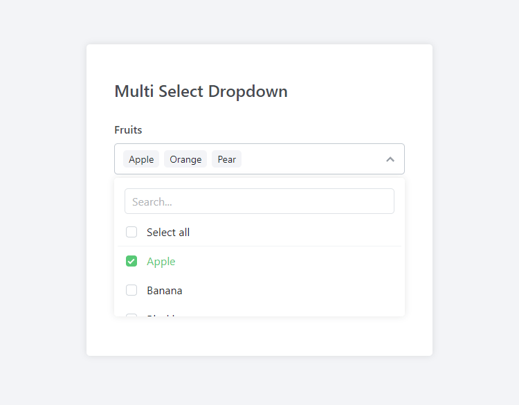
<label for="fruits">Fruits</label>
<select id="fruits" name="fruits" data-placeholder="Select fruits" multiple data-multi-select>
    <option value="Apple">Apple</option>
    <option value="Banana">Banana</option>
    <option value="Blackberry">Blackberry</option>
    <option value="Blueberry">Blueberry</option>
    <option value="Cherry">Cherry</option>
    <option value="Cranberry">Cranberry</option>
    <option value="Grapes">Grapes</option>
    <option value="Kiwi">Kiwi</option>
    <option value="Mango">Mango</option>
    <option value="Orange">Orange</option>
    <option value="Peach">Peach</option>
    <option value="Pear">Pear</option>
    <option value="Pineapple">Pineapple</option>
    <option value="Raspberry">Raspberry</option>
    <option value="Strawberry">Strawberry</option>
    <option value="Watermelon">Watermelon</option>
</select>
So here, we are basically creating our multi-select dropdown element using the native select element. The data-multi-select attribute will determine the type of element. We actually don't need to declare any JS code because all the data is specified within the select element, and to apply our customizable options, we can declare data attributes (data-placeholder, data-max, data-search, etc.).
The snippet above will resemble the following:
If we want to preselect some of the items, we can simply add the selected attribute, like so:
<option value="Cranberry" selected>Cranberry</option>As we can see, the class utilizes native methods, so it's much easier to convert existing elements without the hassle of rewriting the entire code.
3.2. Customizing Options with Data Attributes
To customize existing select elements, we can specify data attributes based on our requirements. Let's go ahead and start applying new options to our multi-select dropdown box.
Limiting the Number of Selectable Items
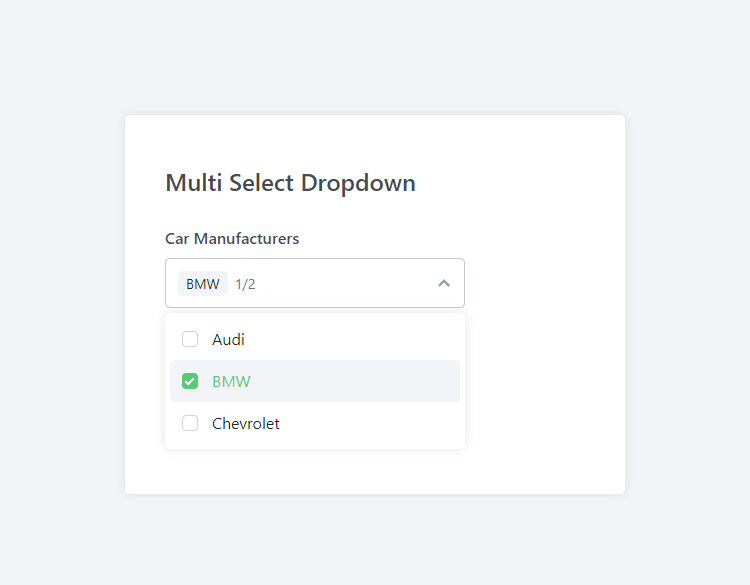
To limit the number of items we can select in the dropdown, we can implement the data-max attribute to our element, like so:
<label for="cars">Car Manufacturers</label>
<select id="cars" name="cars" data-placeholder="Select car manufacturers" data-max="2" multiple data-multi-select>
    <option value="Audi">Audi</option>
    <option value="BMW">BMW</option>
    <option value="Chevrolet">Chevrolet</option>
</select>
In the above example, the user can only select two items from the dropdown list. If we want to increase/decrease the maximum items, we can increment/decrement the data-max value.
Search Function
The search function will enable us to enter a query inside an input box and subsequently filter the items. By default, the search function is enabled, but we can disable it by specifying the data-search attribute, like so:
<label for="cars">Car Manufacturers</label>
<select id="cars" name="cars" data-placeholder="Select car manufacturers" data-max="2" data-search="false" multiple data-multi-select>
    <option value="Audi">Audi</option>
    <option value="BMW">BMW</option>
    <option value="Chevrolet">Chevrolet</option>
</select>
Ideally, you would want to disable it if your dropdown list contains only a few items.
Select All Function
The select all function will enable us to check and uncheck all items in the dropdown list with a single click of a button. Like previously, the select all function is enabled by default, but we can disable it with:
<label for="cars">Car Manufacturers</label>
<select id="cars" name="cars" data-placeholder="Select car manufacturers" data-max="2" data-search="false" data-select-all="false" multiple data-multi-select>
    <option value="Audi">Audi</option>
    <option value="BMW">BMW</option>
    <option value="Chevrolet">Chevrolet</option>
</select>
And just like that, the select all function is disabled.
List All Function
The list all function basically populates all the items in the selected items area. We can disable it with the following code:
<label for="cars">Car Manufacturers</label>
<select id="cars" name="cars" data-placeholder="Select car manufacturers" data-max="2" data-search="false" data-select-all="false" data-list-all="false" multiple data-multi-select>
    <option value="Audi">Audi</option>
    <option value="BMW">BMW</option>
    <option value="Chevrolet">Chevrolet</option>
</select>
If disabled, it will appear in "X selected" format as opposed to populating each individual item.
Useful if you expect the user to select a large number of items from the dropdown list. It will prevent the UI from being cumbersome.
Adjusting the Height and Width
We can set the default height and width in our stylesheet, but if we want to change the size for a particular dropdown element, we can implement the data-width and data-height attributes, like so:
<label for="cars">Car Manufacturers</label>
<select id="cars" name="cars" data-placeholder="Select car manufacturers" data-max="2" data-search="false" data-select-all="false" data-list-all="false" data-width="300px" data-height="50px" multiple data-multi-select>
    <option value="Audi">Audi</option>
    <option value="BMW">BMW</option>
    <option value="Chevrolet">Chevrolet</option>
</select>
Both options aren't mandatory, so you can remove one or the other. The size can be calculated in different formats (pixels, percentages, ems, etc.).
And to customize the size of the dropdown list, we can implement the data-dropdown-width and data-dropdown-height attributes.
With all the options applied above, the multi-select dropdown will resemble the following:
Next up, we'll delve into more advanced methods.
3.3. Dynamic Creation with Custom HTML
Finally, we've reached the fun part of the article! In this section, we'll explore various methods to dynamically generate our multi-select dropdown boxes using JavaScript.
Let's go ahead and create our dynamic select container with the following code:
<label for="dynamic">Dynamic Select</label>
<select id="dynamic" name="dynamic"></select>
The type of the element is irrelevant, meaning we could use a DIV container as opposed to the select element. It's entirely up to you!
Right then! This is where it gets interesting... Let's create a new instance of the MultiSelect class and add some data with custom HTML content. To do that, add the following code to your HTML document:
<script>
// Initialize the Multi Select dropdown
new MultiSelect('#dynamic', {
    data:[
        {
            value: 'opt1',
            text: 'Option 1'
        },
        {
            value: 'opt2',
            html: '<strong>Option 2 with HTML!</strong>'
        },
        {
            value: 'opt3',
            text: 'Option 3',
            selected: true
        },
        {
            value: 'opt4',
            text: 'Option 4'
        },
        {
            value: 'opt5',
            text: 'Option 5'
        }
    ],
    placeholder: 'Select an option',
    search: true,
    selectAll: true,
    listAll: false,
    disabled: false,
    min: 1,
    max: 2
});
</script>
The first parameter selects the element in our HTML document — there are various techniques to select elements. In our case, the hashtag character is prepended to the value, so it will select the element with the ID attribute followed by the value.
The data array consists of objects that will populate items in our dropdown. If we want to customize individual items, we can add the html property (see the second item in the array), which will override the text property.
TipYou can declare multiple instances of the MultiSelect class with different parameters, meaning you can have more than one multi-select dropdown.
With all the data attributes we implemented earlier, we can apply them in a similar format as shown in the example.
Change Event Listener
When the dropdown list has been changed, the change method will be triggered. We can add the event listener with the following code:
<script>
// Initialize the Multi Select dropdown
new MultiSelect('#dynamic', {
    data: ...,
    onChange: function(value, text, element) {
        console.log('Change:', value, text, element);
    }
});
</script>
That will output the arguments to the browser console (item value, etc.).
Select Event Listener
In some cases, we want to execute an event listener that will be triggered when an item is selected. To do that, we can add the following:
<script>
// Initialize the Multi Select dropdown
new MultiSelect('#dynamic', {
    data: ...,
    onSelect: function(value, text, element) {
        console.log('Selected:', value, text, element);
    }
});
</script>
And now, when an item is selected, the item args will be logged to the browser console.
Unselect Event Listener
But what about unselect? We've got you covered! Simply add the following:
<script>
// Initialize the Multi Select dropdown
new MultiSelect('#dynamic', {
    data: ...,
    onUnselect: function(value, text, element) {
        console.log('Unselected:', value, text, element);
    }
});
</script>
Pretty neat, right? With the event listeners listed above, there are no limits to what you can do with the multi-select class.
3.4. OptGroups and Sublists
The library natively supports standard HTML optgroup tags out of the box. When used, group headers automatically become interactive, allowing users to check or uncheck entire sublists with a single click.
<label for="frameworks">Frameworks</label>
<select id="frameworks" name="frameworks[]" multiple data-multi-select>
    <optgroup label="Frontend">
        <option value="react">React</option>
        <option value="vue">Vue.js</option>
    </optgroup>
    <optgroup label="Backend">
        <option value="node">Node.js</option>
        <option value="php">PHP</option>
    </optgroup>
</select>
3.5. Form Validation (Required fields)
Because the library dynamically syncs data with the native hidden select element in the background, standard HTML5 form validation works perfectly. To enforce a selection, simply add the native required attribute. The dropdown will turn red and block form submissions if left empty.
<label for="required-select">Required Selection</label>
<select id="required-select" name="required_select[]" required multiple data-multi-select>
    <option value="1">Option 1</option>
    <option value="2">Option 2</option>
</select>
3.6. Dark Mode & Themes
The dropdown features robust built-in theme support. By default, it is set to auto, meaning it will seamlessly match the user's OS preference (Dark or Light mode). You can also force a specific theme using the data-theme attribute.
<label for="dark-select">Dark Mode Example</label>
<select id="dark-select" name="dark_select[]" data-theme="dark" multiple data-multi-select>
    <option value="1">Dark Option 1</option>
    <option value="2">Dark Option 2</option>
</select>
3.7. Asynchronous Data Fetching
If you need to populate your dropdown with data from a remote database or API, you can instantiate an empty select element and securely fetch arrays using the built-in asynchronous .fetch() method.
<label for="async-select">Async API Fetch</label>
<select id="async-select" name="async_select[]" multiple></select>

<script>
// Initialize an empty instance
const asyncSelect = new MultiSelect('#async-select', {
    placeholder: 'Loading remote data...',
    search: true
});

// Fetch JSON data asynchronously
asyncSelect.fetch('https://api.yoursite.com/data');
</script>
3.8. Full Source Code
Below is the full source code combining all the original and newly added advanced examples outlined in this article.
<!DOCTYPE html>
<html>
	<head>
		<meta charset="utf-8">
        <meta name="viewport" content="width=device-width,minimum-scale=1">
		<title>Multi Select JS</title>
        <!-- Include the Multi Select stylesheet -->
        <link href="MultiSelect.css" rel="stylesheet" type="text/css">
        <style>
        * {
            box-sizing: border-box;
            font-family: system-ui, "Segoe UI", Roboto, Helvetica, Arial, sans-serif, "Apple Color Emoji", "Segoe UI Emoji", "Segoe UI Symbol";
            font-size: 16px;
        }
        body {
            margin: 0;
            padding: 15px;
            background-color: #f3f4f7;
        }
        form {
            display: flex;
            flex-direction: column;
            margin: 100px auto;
            padding: 40px 40px 60px;
            max-width: 500px;
            width: 100%;
            background-color: #fff;
            border-radius: 5px;
            box-shadow: 0 0 10px rgba(0, 0, 0, 0.1);
        }
        form h1 {
            margin: 10px 0 5px;
            font-size: 24px;
            font-weight: 500;
            color: #474b50;
        }
        form label {
            margin: 25px 0 10px;
            font-weight: 500;
            color: #474b50;
        }
        </style>
	</head>
	<body>
        <form>

            <h1>Multi Select Dropdown</h1>

            <!-- Example 1: Simple Dropdown -->
            <label for="fruits">Fruits</label>
            <select id="fruits" name="fruits" data-placeholder="Select fruits" multiple data-multi-select>
                <option value="Apple">Apple</option>
                <option value="Banana">Banana</option>
                <option value="Blackberry">Blackberry</option>
                <option value="Blueberry">Blueberry</option>
                <option value="Cherry">Cherry</option>
                <option value="Cranberry">Cranberry</option>
                <option value="Grapes">Grapes</option>
                <option value="Kiwi">Kiwi</option>
                <option value="Mango">Mango</option>
                <option value="Orange">Orange</option>
                <option value="Peach">Peach</option>
                <option value="Pear">Pear</option>
                <option value="Pineapple">Pineapple</option>
                <option value="Raspberry">Raspberry</option>
                <option value="Strawberry">Strawberry</option>
                <option value="Watermelon">Watermelon</option>
            </select>

            <!-- Example 2: Data Attributes -->
            <label for="cars">Car Manufacturers</label>
            <select id="cars" name="cars" data-placeholder="Select car manufacturers" data-max="2" data-search="false" data-select-all="false" data-list-all="false" data-width="300px" data-height="50px" multiple data-multi-select>
                <option value="Audi">Audi</option>
                <option value="BMW">BMW</option>
                <option value="Chevrolet">Chevrolet</option>
            </select>

            <!-- Example 3: Dynamic Selection via JS -->
            <label for="dynamic">Dynamic Select</label>
            <select id="dynamic" name="dynamic"></select>

            <!-- Example 4: OptGroups -->
            <label for="frameworks">Frameworks (OptGroups)</label>
            <select id="frameworks" name="frameworks[]" multiple data-multi-select>
                <optgroup label="Frontend">
                    <option value="react">React</option>
                    <option value="vue">Vue.js</option>
                </optgroup>
                <optgroup label="Backend">
                    <option value="node">Node.js</option>
                    <option value="php">PHP</option>
                </optgroup>
            </select>

            <!-- Example 5: Required Validation -->
            <label for="required-select">Required Selection</label>
            <select id="required-select" name="required_select[]" required multiple data-multi-select>
                <option value="1">Option 1</option>
                <option value="2">Option 2</option>
            </select>

            <!-- Example 6: Dark Mode -->
            <label for="dark-select">Dark Mode</label>
            <select id="dark-select" name="dark_select[]" data-theme="dark" multiple data-multi-select>
                <option value="1">Dark Option 1</option>
                <option value="2">Dark Option 2</option>
            </select>

            <!-- Example 7: Async Selection -->
            <label for="async-select">Async API Fetch</label>
            <select id="async-select" name="async_select[]" multiple></select>

            <button type="submit" style="margin-top: 30px; padding: 10px;">Submit Form</button>
        </form>

        <!-- Include the Multi Select JS class -->
        <script src="MultiSelect.js"></script>

        <script>
        // Initialize the Dynamic Multi Select dropdown
        const dynamicSelect = new MultiSelect('#dynamic', {
            data:[
                {
                    value: 'opt1',
                    text: 'Option 1'
                },
                {
                    value: 'opt2',
                    html: '<strong>Option 2 with HTML!</strong>'
                },
                {
                    value: 'opt3',
                    text: 'Option 3',
                    selected: true
                },
                {
                    value: 'opt4',
                    text: 'Option 4'
                },
                {
                    value: 'opt5',
                    text: 'Option 5'
                }
            ],
            placeholder: 'Select an option',
            search: true,
            selectAll: true,
            listAll: false,
            disabled: false,
            max: 2,
            min: 1,
            onChange: function(value, text, element) {
                console.log('Change:', value, text, element);
                // Use the selectedItems property to get the selected items
                console.log(dynamicSelect.selectedItems);
            },
            onSelect: function(value, text, element) {
                console.log('Selected:', value, text, element);
            },
            onUnselect: function(value, text, element) {
                console.log('Unselected:', value, text, element);
            }
        });

        // Initialize the Async Multi Select dropdown
        const asyncSelect = new MultiSelect('#async-select', {
            placeholder: 'Loading data...',
            search: true
        });

        // Example data structure fetching
        // asyncSelect.fetch('https://api.yoursite.com/data');
        </script>

    </body>
</html>
Don't forget to add the MultiSelect.css stylesheet and MultiSelect.js JavaScript class files to your project folder.
4. Reference
Below, you'll find the reference tables for the MultiSelect.js class.
| Option | Type | Default | Description |
| placeholder | String | Select item(s) | The default placeholder text for the multi-select element. |
| name | String | empty | The name attribute for the select element. |
| theme | String | auto | Sets the color theme of the dropdown. Accepts auto (follows OS preference), light, or dark. |
| required | Boolean | false | If true, enforces native HTML5 form validation, preventing form submission until at least one item is selected. |
| min | Number | null | The minimum number of items that must be selected. If null, there is no limit. Applies a red invalid state if unmet. |
| max | Number | null | The maximum number of items that can be selected. If null, there is no limit. |
| disabled | Boolean | false | Determines whether the entire multi-select element is disabled or not. |
| search | Boolean | true | Determines whether the search input box is enabled or disabled. |
| selectAll | Boolean | true | Determines whether the "Select all" toggle is enabled or disabled. |
| listAll | Boolean | true | Determines whether selected items list as individual tags in the header. If false, the selected value will compactly appear as "X selected". |
| closeListOnItemSelect | Boolean | false | If true, the dropdown menu will automatically close immediately after a user clicks an item. |
| width | String | empty | The width of the multi-select element, specified as a CSS value (e.g., '100px', '50%'). |
| height | String | empty | The height of the multi-select element, specified as a CSS value. |
| dropdownWidth | String | empty | The width of the multi-select dropdown menu, specified as a CSS value (e.g., '100px', '50%'). |
| dropdownHeight | String | empty | The height of the multi-select dropdown menu, specified as a CSS value. |
| data | Array | empty | An array of objects representing each item in the select element. See the reference table below. |
| onChange | Function | function() {} | A callback function executed when the selected item changes. It receives the selected value and text as arguments. |
| onSelect | Function | function() {} | A callback function executed specifically when an item is selected. |
| onUnselect | Function | function() {} | A callback function executed specifically when an item is unselected. |
| onMaxReached | Function | function() {} | A callback function executed when the user tries to select an item but the max limit has been reached. |
The reference table for the data array.
| Property | Type | Description |
| value | String | The value attribute of the item in the multi-select element. |
| text | String | The display text for the item. |
| group | String | The OptGroup header this item belongs to. Items with the same group string are grouped together with a master toggle. |
| selected | Boolean | Determines whether the option is selected by default. |
| disabled | Boolean | If true, this specific option is grayed out and blocked from user interaction. |
| html | String | Custom HTML content for the item. If provided, it overrides the text property in the dropdown visually. |
To apply the properties to inline select elements, we can prepend data- to the property name and declare it in our element along with the value.
Conclusion
Modernizing the native select elements is imperative for sites seeking long-term growth and user-friendly design. With modern JS, the possibilities are endless. That being said, this guide aims to cover all aspects related to multi-select dropdowns with practical examples and a robust JS class.
Looking for another UI element with customizable options? Let us know your suggestions in the comments section below. We'd love to hear from you!
You can download the full source code from our GitHub repository: https://github.com/codeshackio/multi-select-dropdown-js
Thanks for reading!
Released under the MIT license.