 Download the full source codeComplete working project · Setup guide included · Free for commercial use
Free ZIP
Download the full source codeComplete working project · Setup guide included · Free for commercial use
Free ZIP
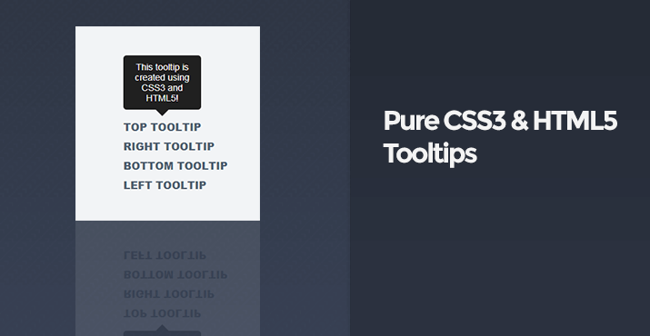
For this tutorial I'll show you how you can create your very own simple tooltips using only CSS3 and HTML5, no JavaScript required. Tooltips are handy if you would like to show a title or description when you hover over a link or image etc.
It's interesting to see modern websites using various techniques to create features like tooltips, the most common way, that most websites use is JavaScript based tooltips, with the support of CSS3 and HTML5 on all major browsers it's now easy to do this using only CSS3 and HTML5, on a plus side, the less JavaScript the better right? Who needs JavaScript when CSS3 can accomplish the task.
Simple Tooltips
Before we get started on creating the tooltips we need to create a new HTML file and CSS file, or you could put the CSS in your HTML file, whichever works best for you.
Let's go ahead and create the HTML file with 4 links, these links will represent the tooltips on each side (top, left, bottom, and right).
index.html:<!DOCTYPE html>
<html>
<head>
<meta charset="utf-8">
<title>Pure CSS3 and HTML5 Tooltips</title>
</head>
<body>
<a href="#" data-tooltip="This tooltip is created using CSS3 and HTML5!">Top Tooltip</a>
<br>
<a href="#" data-tooltip-right="This tooltip is created using CSS3 and HTML5!">Right Tooltip</a>
<br>
<a href="#" data-tooltip-bottom="This tooltip is created using CSS3 and HTML5!">Bottom Tooltip</a>
<br>
<a href="#" data-tooltip-left="This tooltip is created using CSS3 and HTML5!">Left Tooltip</a>
</body>
</html>We can now start styling the tooltips with CSS3, as you can see in the above code we are using the data attributes to determine what the tooltip will contain, with CSS it's possible to display the text within the attribute and customize it to your liking.
Before we start to style the tooltips lets add some basic style to the document and links, add the CSS code in your CSS file:
body {
	font-family: Arial, Helvetica, sans-serif;
	padding: 150px;
	background: #f2f4f6;
}
a {
	text-decoration: none;
	font-weight: 800;
	color: #4d4d4d;
	text-transform: uppercase;
	line-height: 30px;
	color: #4e5e71;
}
It should now look like this:
We can now style the tooltips with the following code, a basic tooltip:
[data-tooltip]:hover {
	position: relative;
}
[data-tooltip]:hover::before {
	all: initial;
	font-family: Arial, Helvetica, sans-serif;
	display: inline-block;
	border-radius: 5px;
	padding: 10px;
	background-color: #1a1a1a;
	content: attr(data-tooltip);
	color: #f9f9f9;
	position: absolute;
	bottom: 100%;
	width: 100px;
	left: 50%;
	transform: translate(-50%, 0);
	margin-bottom: 15px;
	text-align: center;
	font-size: 14px;
}
Will output the following:
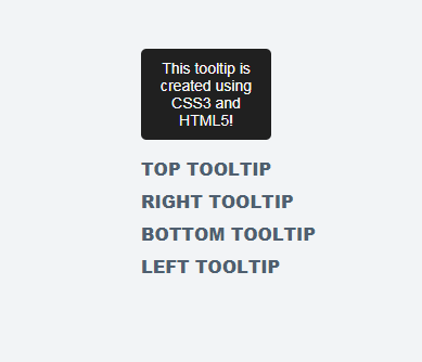
To make it more appealing we can add a caret to the tooltip, add the following code to your CSS:
[data-tooltip]:hover::after {
	all: initial;
	display: inline-block;
	width: 0;
	height: 0;
	border-left: 10px solid transparent;
	border-right: 10px solid transparent;
	border-top: 10px solid #1a1a1a;
	position: absolute;
	bottom: 100%;
	content: '';
	left: 50%;
	transform: translate(-50%, 0);
	margin-bottom: 5px;
}
The tooltips will now look like this:
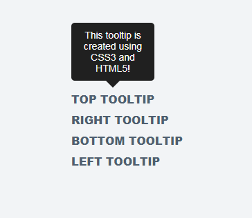
Now we have a basic tooltip we can use for many elements that support the ::before and ::after selectors. We are also using the all attribute which resets the styling for that element, basically, if we want to style those links, we don't want it to apply the styles to the tooltips also.
Getting the tooltips to display on each side is a bit more complicated, requires more CSS code, replace your existing tooltip CSS with the following code:
[data-tooltip-bottom]:hover,
[data-tooltip-left]:hover,
[data-tooltip-right]:hover,
[data-tooltip]:hover {
	position: relative;
}
[data-tooltip-bottom]:hover::after,
[data-tooltip-left]:hover::after,
[data-tooltip-right]:hover::after,
[data-tooltip]:hover::after {
	all: initial;
	display: inline-block;
	width: 0;
	height: 0;
	border-left: 10px solid transparent;
	border-right: 10px solid transparent;
	border-top: 10px solid #1a1a1a;
	position: absolute;
	bottom: 100%;
	content: '';
	left: 50%;
	transform: translate(-50%, 0);
	margin-bottom: 5px;
}
[data-tooltip-right]:hover::after {
	margin-bottom: 0;
	bottom: auto;
	transform: rotate(90deg) translate(0, -50%);
	left: 100%;
	top: 50%;
	margin-left: -5px;
	margin-top: -5px;
}
[data-tooltip-left]:hover::after {
	margin-bottom: 0;
	bottom: auto;
	transform: rotate(-90deg) translate(0, -50%);
	left: auto;
	right: 100%;
	top: 50%;
	margin-right: -5px;
	margin-top: -5px;
}
[data-tooltip-bottom]:hover::after {
	margin-bottom: 0;
	bottom: auto;
	transform: rotate(180deg) translate(-50%, 0);
	top: 100%;
	margin-left: -20px;
	margin-top: 5px;
}
[data-tooltip-bottom]:hover::before,
[data-tooltip-left]:hover::before,
[data-tooltip-right]:hover::before,
[data-tooltip]:hover::before {
	all: initial;
	font-family: Arial, Helvetica, sans-serif;
	display: inline-block;
	border-radius: 5px;
	padding: 10px;
	background-color: #1a1a1a;
	content: attr(data-tooltip);
	color: #f9f9f9;
	position: absolute;
	bottom: 100%;
	width: 100px;
	left: 50%;
	transform: translate(-50%, 0);
	margin-bottom: 15px;
	text-align: center;
	font-size: 14px;
}
[data-tooltip-right]:hover::before {
	margin-bottom: 0;
	bottom: auto;
	transform: translate(0, -50%);
	left: 100%;
	top: 50%;
	content: attr(data-tooltip-right);
	margin-left: 15px;
}
[data-tooltip-left]:hover::before {
	margin-bottom: 0;
	bottom: auto;
	transform: translate(0, -50%);
	left: auto;
	right: 100%;
	top: 50%;
	content: attr(data-tooltip-left);
	margin-right: 15px;
}
[data-tooltip-bottom]:hover::before {
	margin-bottom: 0;
	bottom: auto;
	top: 100%;
	content: attr(data-tooltip-bottom);
	margin-top: 15px;
}
We can now show tooltips on every side. Feel free to use the above code and modify it, the above code is how you create simple tooltips, next we will move onto dynamic tooltips where we will be able to display HTML content in the tooltip itself, which is pretty neat if you would like to display images, headings, and paragraphs.
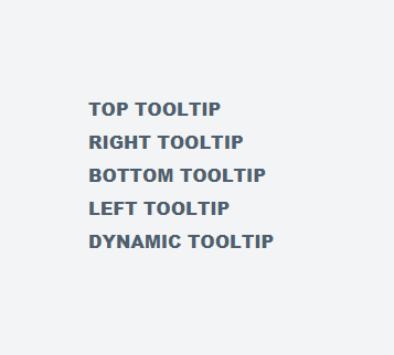
Dynamic Tooltips
If you would like to use HTML in your tooltips, for example, you might want to use images in your tooltips or headings, all we need to do is alter our existing code.
Add the following code to your HTML document:
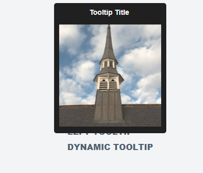
<a href="#" class="tooltip">
	<span class="tooltip-dynamic">
		<b>Tooltip Title</b>
		<br>
		<br>
		<img src="https://codeshack.io/web/img/uploads/photo200x200.jpg" alt="">
	</span>
	Dynamic Tooltip
</a>
All we need to do now is to change our existing CSS code to support the dynamic tooltips, change your CSS tooltips code to the following:
.tooltip:hover,
[data-tooltip-bottom]:hover,
[data-tooltip-left]:hover,
[data-tooltip-right]:hover,
[data-tooltip]:hover {
	position: relative;
}
[data-tooltip-bottom]:hover::after,
[data-tooltip-left]:hover::after,
[data-tooltip-right]:hover::after,
[data-tooltip]:hover::after {
	all: initial;
	display: inline-block;
	width: 0;
	height: 0;
	border-left: 10px solid transparent;
	border-right: 10px solid transparent;
	border-top: 10px solid #1a1a1a;
	position: absolute;
	bottom: 100%;
	content: '';
	left: 50%;
	transform: translate(-50%, 0);
	margin-bottom: 5px;
}
[data-tooltip-right]:hover::after {
	margin-bottom: 0;
	bottom: auto;
	transform: rotate(90deg) translate(0, -50%);
	left: 100%;
	top: 50%;
	margin-left: -5px;
	margin-top: -5px;
}
[data-tooltip-left]:hover::after {
	margin-bottom: 0;
	bottom: auto;
	transform: rotate(-90deg) translate(0, -50%);
	left: auto;
	right: 100%;
	top: 50%;
	margin-right: -5px;
	margin-top: -5px;
}
[data-tooltip-bottom]:hover::after {
	margin-bottom: 0;
	bottom: auto;
	transform: rotate(180deg) translate(-50%, 0);
	top: 100%;
	margin-left: -20px;
	margin-top: 5px;
}
.tooltip:hover .tooltip-dynamic-bottom,
.tooltip:hover .tooltip-dynamic-left,
.tooltip:hover .tooltip-dynamic-right,
.tooltip:hover .tooltip-dynamic,
[data-tooltip-bottom]:hover::before,
[data-tooltip-left]:hover::before,
[data-tooltip-right]:hover::before,
[data-tooltip]:hover::before {
	all: initial;
	font-family: Arial, Helvetica, sans-serif;
	display: inline-block;
	border-radius: 5px;
	padding: 10px;
	background-color: #1a1a1a;
	content: attr(data-tooltip);
	color: #f9f9f9;
	position: absolute;
	bottom: 100%;
	width: 100px;
	left: 50%;
	transform: translate(-50%, 0);
	margin-bottom: 15px;
	text-align: center;
	font-size: 14px;
}
.tooltip:hover .tooltip-dynamic-right,
[data-tooltip-right]:hover::before {
	margin-bottom: 0;
	bottom: auto;
	transform: translate(0, -50%);
	left: 100%;
	top: 50%;
	content: attr(data-tooltip-right);
	margin-left: 15px;
}
.tooltip:hover .tooltip-dynamic-left,
[data-tooltip-left]:hover::before {
	margin-bottom: 0;
	bottom: auto;
	transform: translate(0, -50%);
	left: auto;
	right: 100%;
	top: 50%;
	content: attr(data-tooltip-left);
	margin-right: 15px;
}
.tooltip:hover .tooltip-dynamic-bottom,
[data-tooltip-bottom]:hover::before {
	margin-bottom: 0;
	bottom: auto;
	top: 100%;
	content: attr(data-tooltip-bottom);
	margin-top: 15px;
}
.tooltip .tooltip-dynamic-bottom,
.tooltip .tooltip-dynamic-left,
.tooltip .tooltip-dynamic-right,
.tooltip .tooltip-dynamic {
	display: none;
	width: auto !important;
}
The dynamic tooltips will look like this:
Conclusion
You should now have a basic understanding of how to create tooltips using only CSS3 and HTML5. One problem with tooltips is that they will not really be visible on mobile devices, that is if your intention is to use the tooltips for links, with static content that doesn't link to anywhere it's possible, you can add the CSS :active selector in your code which will show the tooltip when the user touches/taps the element, this will set the element active and thus activate the CSS selector.
You can view and download the full source code here: CSS3 Tooltips
Skip the copy-pasting and get the complete, working project from this tutorial as a free ZIP with a setup guide included. Free for personal and commercial use.