 Download the full source codeComplete working project · Setup guide included · Free for commercial use
Free ZIP
Download the full source codeComplete working project · Setup guide included · Free for commercial use
Free ZIP
In this guide, we'll utilize a JavaScript class to extend the functionality of the native select element with images and custom HTML code. In modern web apps, form element customization has become a staple in providing a unique experience, and therefore staying ahead of the curve is essential to a successful online platform.
The HTML select element is used for selecting options from a dropdown list and is a popular form element used on the web, but unfortunately, there are customization limitations on what we can do with the options in the dropdown list.
By the end of this tutorial, you'll have a clear understanding of how to create a dynamic select element that not only functions flawlessly but also aligns perfectly with your site’s design and user experience goals, so without further ado, let's get started!
1. Stylesheet (CSS3)
Styling with the native select element is limited, but because our new element will consist of multiple container elements, the possibilities are endless. We have the option to freely customize it to our liking.
Create a new file named DynamicSelect.css and add the following code:
.dynamic-select {
  display: flex;
  box-sizing: border-box;
  flex-direction: column;
  position: relative;
  width: 100%;
  user-select: none;
}
.dynamic-select .dynamic-select-header {
  border: 1px solid #dee2e6;
  padding: 7px 30px 7px 12px;
}
.dynamic-select .dynamic-select-header::after {
  content: "";
  display: block;
  position: absolute;
  top: 50%;
  right: 15px;
  transform: translateY(-50%);
  background-image: url("data:image/svg+xml,%3Csvg xmlns='http://www.w3.org/2000/svg' fill='%23949ba3' viewBox='0 0 16 16'%3E%3Cpath d='M8 13.1l-8-8 2.1-2.2 5.9 5.9 5.9-5.9 2.1 2.2z'/%3E%3C/svg%3E");
  height: 12px;
  width: 12px;
}
.dynamic-select .dynamic-select-header.dynamic-select-header-active {
  border-color: #c1c9d0;
}
.dynamic-select .dynamic-select-header.dynamic-select-header-active::after {
  transform: translateY(-50%) rotate(180deg);
}
.dynamic-select .dynamic-select-header.dynamic-select-header-active + .dynamic-select-options {
  display: flex;
}
.dynamic-select .dynamic-select-header .dynamic-select-header-placeholder {
  color: #65727e;
}
.dynamic-select .dynamic-select-options {
  display: none;
  box-sizing: border-box;
  flex-flow: wrap;
  position: absolute;
  top: 100%;
  left: 0;
  right: 0;
  z-index: 999;
  margin-top: 5px;
  padding: 5px;
  background-color: #fff;
  border-radius: 5px;
  box-shadow: 0 0 10px rgba(0, 0, 0, 0.1);
  max-height: 200px;
  overflow-y: auto;
  overflow-x: hidden;
}
.dynamic-select .dynamic-select-options::-webkit-scrollbar {
  width: 5px;
}
.dynamic-select .dynamic-select-options::-webkit-scrollbar-track {
  background: #f0f1f3;
}
.dynamic-select .dynamic-select-options::-webkit-scrollbar-thumb {
  background: #cdcfd1;
}
.dynamic-select .dynamic-select-options::-webkit-scrollbar-thumb:hover {
  background: #b2b6b9;
}
.dynamic-select .dynamic-select-options .dynamic-select-option {
  padding: 7px 12px;
}
.dynamic-select .dynamic-select-options .dynamic-select-option:hover, .dynamic-select .dynamic-select-options .dynamic-select-option:active {
  background-color: #f3f4f7;
}
.dynamic-select .dynamic-select-header, .dynamic-select .dynamic-select-option {
  display: flex;
  box-sizing: border-box;
  align-items: center;
  border-radius: 5px;
  cursor: pointer;
  display: flex;
  align-items: center;
  width: 100%;
  height: 45px;
  font-size: 16px;
  color: #212529;
}
.dynamic-select .dynamic-select-header img, .dynamic-select .dynamic-select-option img {
  object-fit: contain;
  max-height: 100%;
  max-width: 100%;
}
.dynamic-select .dynamic-select-header img.dynamic-size, .dynamic-select .dynamic-select-option img.dynamic-size {
  object-fit: fill;
  max-height: none;
  max-width: none;
}
.dynamic-select .dynamic-select-header img, .dynamic-select .dynamic-select-header svg, .dynamic-select .dynamic-select-header i, .dynamic-select .dynamic-select-header span, .dynamic-select .dynamic-select-option img, .dynamic-select .dynamic-select-option svg, .dynamic-select .dynamic-select-option i, .dynamic-select .dynamic-select-option span {
  box-sizing: border-box;
  margin-right: 10px;
}
.dynamic-select .dynamic-select-header.dynamic-select-no-text, .dynamic-select .dynamic-select-option.dynamic-select-no-text {
  justify-content: center;
}
.dynamic-select .dynamic-select-header.dynamic-select-no-text img, .dynamic-select .dynamic-select-header.dynamic-select-no-text svg, .dynamic-select .dynamic-select-header.dynamic-select-no-text i, .dynamic-select .dynamic-select-header.dynamic-select-no-text span, .dynamic-select .dynamic-select-option.dynamic-select-no-text img, .dynamic-select .dynamic-select-option.dynamic-select-no-text svg, .dynamic-select .dynamic-select-option.dynamic-select-no-text i, .dynamic-select .dynamic-select-option.dynamic-select-no-text span {
  margin-right: 0;
}
.dynamic-select .dynamic-select-header .dynamic-select-option-text, .dynamic-select .dynamic-select-option .dynamic-select-option-text {
  box-sizing: border-box;
  flex: 1;
  overflow: hidden;
  text-overflow: ellipsis;
  white-space: nowrap;
  color: inherit;
  font-size: inherit;
}
We're utilizing modern properties such as flex, object-fit, and overflow to create a flawless experience.
Once created, we can include it later on in the <head> section of our HTML document with the following line of code:
<link href="DynamicSelect.css" rel="stylesheet" type="text/css">That's essentially all we need to do for this section. Feel free to customize the stylesheet to reflect your website design.
2. JavaScript Class
This custom JavaScript class is perfectly crafted to seamlessly integrate images into dropdown menus, providing a richer user experience. It replaces the native select element with customizable elements, enabling us to add images, SVGs, and custom HTML content.
Create a new file named DynamicSelect.js and add the following code:
/*
 * Created by David Adams
 * https://codeshack.io/dynamic-select-images-html-javascript/
 *
 * Released under the MIT license
 */
class DynamicSelect {

    constructor(element, options = {}) {
        let defaults = {
            placeholder: 'Select an option',
            columns: 1,
            name: '',
            width: '',
            height: '',
            data: [],
            onChange: function() {}
        };
        this.options = Object.assign(defaults, options);
        this.selectElement = typeof element === 'string' ? document.querySelector(element) : element;
        for(const prop in this.selectElement.dataset) {
            if (this.options[prop] !== undefined) {
                this.options[prop] = this.selectElement.dataset[prop];
            }
        }
        this.name = this.selectElement.getAttribute('name') ? this.selectElement.getAttribute('name') : 'dynamic-select-' + Math.floor(Math.random() * 1000000);
        if (!this.options.data.length) {
            let options = this.selectElement.querySelectorAll('option');
            for (let i = 0; i < options.length; i++) {
                this.options.data.push({
                    value: options[i].value,
                    text: options[i].innerHTML,
                    img: options[i].getAttribute('data-img'),
                    selected: options[i].selected,
                    html: options[i].getAttribute('data-html'),
                    imgWidth: options[i].getAttribute('data-img-width'),
                    imgHeight: options[i].getAttribute('data-img-height')
                });
            }
        }
        this.element = this._template();
        this.selectElement.replaceWith(this.element);
        this._updateSelected();
        this._eventHandlers();
    }

    _template() {
        let optionsHTML = '';
        for (let i = 0; i < this.data.length; i++) {
            let optionWidth = 100 / this.columns;
            let optionContent = '';
            if (this.data[i].html) {
                optionContent = this.data[i].html;
            } else {
                optionContent = `
                    ${this.data[i].img ? `<img src="${this.data[i].img}" alt="${this.data[i].text}" class="${this.data[i].imgWidth && this.data[i].imgHeight ? 'dynamic-size' : ''}" style="${this.data[i].imgWidth ? 'width:' + this.data[i].imgWidth + ';' : ''}${this.data[i].imgHeight ? 'height:' + this.data[i].imgHeight + ';' : ''}">` : ''}
                    ${this.data[i].text ? '<span class="dynamic-select-option-text">' + this.data[i].text + '</span>' : ''}
                `;
            }
            optionsHTML += `
                <div class="dynamic-select-option${this.data[i].value == this.selectedValue ? ' dynamic-select-selected' : ''}${this.data[i].text || this.data[i].html ? '' : ' dynamic-select-no-text'}" data-value="${this.data[i].value}" style="width:${optionWidth}%;${this.height ? 'height:' + this.height + ';' : ''}">
                    ${optionContent}
                </div>
            `;
        }
        let template = `
            <div class="dynamic-select ${this.name}"${this.selectElement.id ? ' id="' + this.selectElement.id + '"' : ''} style="${this.width ? 'width:' + this.width + ';' : ''}${this.height ? 'height:' + this.height + ';' : ''}">
                <input type="hidden" name="${this.name}" value="${this.selectedValue}">
                <div class="dynamic-select-header" style="${this.width ? 'width:' + this.width + ';' : ''}${this.height ? 'height:' + this.height + ';' : ''}"><span class="dynamic-select-header-placeholder">${this.placeholder}</span></div>
                <div class="dynamic-select-options" style="${this.options.dropdownWidth ? 'width:' + this.options.dropdownWidth + ';' : ''}${this.options.dropdownHeight ? 'height:' + this.options.dropdownHeight + ';' : ''}">${optionsHTML}</div>
            </div>
        `;
        let element = document.createElement('div');
        element.innerHTML = template;
        return element;
    }

    _eventHandlers() {
        this.element.querySelectorAll('.dynamic-select-option').forEach(option => {
            option.onclick = () => {
                this.element.querySelectorAll('.dynamic-select-selected').forEach(selected => selected.classList.remove('dynamic-select-selected'));
                option.classList.add('dynamic-select-selected');
                this.element.querySelector('.dynamic-select-header').innerHTML = option.innerHTML;
                this.element.querySelector('input').value = option.getAttribute('data-value');
                this.data.forEach(data => data.selected = false);
                this.data.filter(data => data.value == option.getAttribute('data-value'))[0].selected = true;
                this.element.querySelector('.dynamic-select-header').classList.remove('dynamic-select-header-active');
                this.options.onChange(option.getAttribute('data-value'), option.querySelector('.dynamic-select-option-text') ? option.querySelector('.dynamic-select-option-text').innerHTML : '', option);
            };
        });
        this.element.querySelector('.dynamic-select-header').onclick = () => {
            this.element.querySelector('.dynamic-select-header').classList.toggle('dynamic-select-header-active');
        };
        if (this.selectElement.id && document.querySelector('label[for="' + this.selectElement.id + '"]')) {
            document.querySelector('label[for="' + this.selectElement.id + '"]').onclick = () => {
                this.element.querySelector('.dynamic-select-header').classList.toggle('dynamic-select-header-active');
            };
        }
        document.addEventListener('click', event => {
            if (!event.target.closest('.' + this.name) && !event.target.closest('label[for="' + this.selectElement.id + '"]')) {
                this.element.querySelector('.dynamic-select-header').classList.remove('dynamic-select-header-active');
            }
        });
    }

    _updateSelected() {
        if (this.selectedValue) {
            this.element.querySelector('.dynamic-select-header').innerHTML = this.element.querySelector('.dynamic-select-selected').innerHTML;
        }
    }

    get selectedValue() {
        let selected = this.data.filter(option => option.selected);
        selected = selected.length ? selected[0].value : '';
        return selected;
    }

    set data(value) {
        this.options.data = value;
    }

    get data() {
        return this.options.data;
    }

    set selectElement(value) {
        this.options.selectElement = value;
    }

    get selectElement() {
        return this.options.selectElement;
    }

    set element(value) {
        this.options.element = value;
    }

    get element() {
        return this.options.element;
    }

    set placeholder(value) {
        this.options.placeholder = value;
    }

    get placeholder() {
        return this.options.placeholder;
    }

    set columns(value) {
        this.options.columns = value;
    }

    get columns() {
        return this.options.columns;
    }

    set name(value) {
        this.options.name = value;
    }

    get name() {
        return this.options.name;
    }

    set width(value) {
        this.options.width = value;
    }

    get width() {
        return this.options.width;
    }

    set height(value) {
        this.options.height = value;
    }

    get height() {
        return this.options.height;
    }

}
document.querySelectorAll('[data-dynamic-select]').forEach(select => new DynamicSelect(select));
At the end of the class is a line of code that will automatically declare a new instance of the class if the data-dynamic-select attribute is specified, meaning it is completely optional to implement JS code to create a new Dynamic Select element.
We can include the JavaScript class with the following line of code:
<script src="DynamicSelect.js"></script>Prepending it to the body tag is recommended.
One of the key benefits of using the class is that it doesn't depend on any other framework or library, such as jQuery or Bootstrap. So, because of that, it's lightweight in size and optimized for performance — a sluggish UI can have a negative impact on SEO.
All the elements declared in the class are prefixed to prevent conflict issues with existing stylesheets.
3. Examples
In this section, we'll utilize the dynamic select class to incorporate into your own project, taking you through a series of practical examples that range from basic implementations to more advanced use cases.
3.1. Basic
The basic examples are straightforward and relatively easy to implement into any project. It requires minimal effort and will work for almost any <select> element.
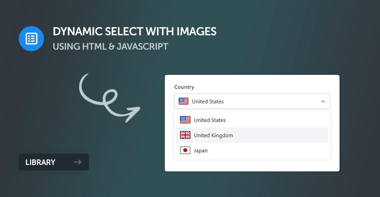
Add Images to existing Select Elements
To add new images to existing select elements, we can specify the data-img on one or more of our options, like so:
<label for="country">Country</label>
<select id="country" name="country" data-placeholder="Select a country" data-dynamic-select>
    <option value="United States" data-img="flags/us.png">United States</option>
    <option value="United Kingdom" data-img="flags/uk.png">United Kingdom</option>
    <option value="Japan" data-img="flags/ja.png">Japan</option>
</select>
Which will resemble the following:
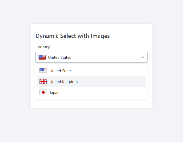
The data-dynamic-select attribute will automatically convert our old native select element to a dynamic dropdown select.
The size of the image will automatically adapt to the space available within the option element while maintaining the aspect ratio. We can override these settings by specifying the data-img-width and/or data-img-height attributes, like so:
<option value="United Kingdom" data-img="flags/uk.png" data-img-width="16px" data-img-height="16px">United Kingdom</option>Pretty neat, right? But that's not all! We can dynamically create it with JS and apply additional options, which we will do next.
Dynamic Creation with JS
If we remove the data-dynamic-select attribute from the select element, we can create a new instance with pure JS:
new DynamicSelect('#country', {
    width: '200px',
    placeholder: 'Select a country',
    name: 'my-custom-select',
    onChange: function(value, text, option) {
    	console.log(value, text, option);
    }
});
Essentially, what happens here is the class will select the element based on the query selector in the first argument, so in this example, we're selecting the element with the ID of country (the select element we declared previously).
The second argument is an object containing all the options, which aren't mandatory but are there for customization purposes. The primary argument is the first argument that selects the HTML element. The full list of options is available in the reference section.
3.2. Advanced
We'll cover advanced techniques in the advanced examples section, which will include custom option content (HTML), dropdown columns, SVG icons, and how to dynamically declare an array of options with JS.
Aggregate Dropdown Options with Arrays
We can dynamically group all our options into an associative array with the following code:
new DynamicSelect('#photo', {
    height: '100px',
    width: '160px',
    dropdownWidth: '400px',
    placeholder: 'Select a photo',
    data: [
        {
        	text: 'Beach',
            value: 'option1',
            img: 'images/beach.jpg'
        },
        {
        	text: 'Abandoned Building',
            value: 'option2',
            img: 'images/abandoned-building.jpg'
        },
        {
        	text: 'Abandoned Building',
            value: 'option3',
            img: 'images/city.jpg'
        },
        {
        	text: 'Mountain',
            value: 'option4',
            img: 'images/mountain.jpg'
        },
        {
        	text: 'Stars',
            value: 'option5',
            img: 'images/stars.jpg'
        },
        {
        	text: 'Road',
            value: 'option6',
            img: 'images/road.jpg'
        }
    ],
});
The data option accepts an associative array of objects representing the select option. Each object accepts the text, value, img, imgWidth, imgHeight, selected, and html properties.
However, the code will only work if we have the following element declared in our document:
<label for="photo">Photo</label>
<select id="photo" name="photo"></select>
We have more control over our options using this technique as opposed to the inline data attributes.
Implementing Columns
Let's say we want our images in the dropdown list to appear in a grid-like view. We can do that by specifying the columns attribute and removing the option text (it's not essential) with the code below.
new DynamicSelect('#photo', {
    columns: 3,
    height: '100px',
    width: '160px',
    dropdownWidth: '400px',
    placeholder: 'Select a photo',
    data: [
        {
            value: 'Beach',
            img: 'images/beach.jpg',
            imgWidth: '100px',
            imgHeight: '80px'
        },
        {
            value: 'Abandoned Building',
            img: 'images/abandoned-building.jpg',
            imgWidth: '100px',
            imgHeight: '80px'
        },
        {
            value: 'City',
            img: 'images/city.jpg',
            imgWidth: '100px',
            imgHeight: '80px'
        },
        {
            value: 'Mountain',
            img: 'images/mountain.jpg',
            imgWidth: '100px',
            imgHeight: '80px'
        },
        {
            value: 'Stars',
            img: 'images/stars.jpg',
            imgWidth: '100px',
            imgHeight: '80px'
        },
        {
            value: 'Road',
            img: 'images/road.jpg',
            imgWidth: '100px',
            imgHeight: '80px'
        }
    ],
});
For the dropdown options to be coherent, equal widths and heights have been specified for all options.
The code above will resemble the following:
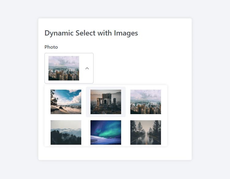
This solution is ideal if we only require images to be populated in the dropdown element.
Content Customization
Specifiying the html property for an option will override the content with custom HTML. It's useful if we want to implement elements that aren't images, such as SVG icons or conventional HTML elements (strong, italic, etc.).
Let's put it into practical use:
new DynamicSelect('#fontstyle', {
    placeholder: 'Select a font style',
    data: [
        {
            value: 'bold',
            html: `
                <svg xmlns="http://www.w3.org/2000/svg" height="16" width="12" viewBox="0 0 384 512"><!--!Font Awesome Free 6.5.1 by @fontawesome - https://fontawesome.com License - https://fontawesome.com/license/free Copyright 2024 Fonticons, Inc.--><path d="M0 64C0 46.3 14.3 32 32 32H80 96 224c70.7 0 128 57.3 128 128c0 31.3-11.3 60.1-30 82.3c37.1 22.4 62 63.1 62 109.7c0 70.7-57.3 128-128 128H96 80 32c-17.7 0-32-14.3-32-32s14.3-32 32-32H48V256 96H32C14.3 96 0 81.7 0 64zM224 224c35.3 0 64-28.7 64-64s-28.7-64-64-64H112V224H224zM112 288V416H256c35.3 0 64-28.7 64-64s-28.7-64-64-64H224 112z"/></svg>
                <span style="font-weight: bold;">Bold</span>
            `
        },
        {
            value: 'italic',
            html: `
                <svg xmlns="http://www.w3.org/2000/svg" height="16" width="12" viewBox="0 0 384 512"><!--!Font Awesome Free 6.5.1 by @fontawesome - https://fontawesome.com License - https://fontawesome.com/license/free Copyright 2024 Fonticons, Inc.--><path d="M128 64c0-17.7 14.3-32 32-32H352c17.7 0 32 14.3 32 32s-14.3 32-32 32H293.3L160 416h64c17.7 0 32 14.3 32 32s-14.3 32-32 32H32c-17.7 0-32-14.3-32-32s14.3-32 32-32H90.7L224 96H160c-17.7 0-32-14.3-32-32z"/></svg>
                <span style="font-style: italic;">Italic</span>
            `
        }
    ],
});
The above code will resemble the following:
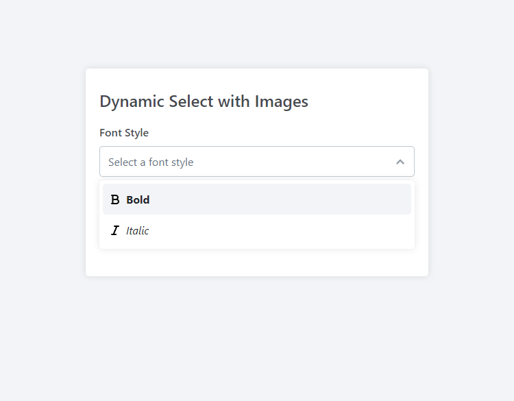
But that's not all... Leveraging the html property enables us to customize the option to our liking and include any HTML element that we desire. The possibilities are endless!
3.3. Full Source Code
Below is the entire source code for all the examples we've gone through.
<!DOCTYPE html>
<html>
	<head>
		<meta charset="utf-8">
        <meta name="viewport" content="width=device-width,minimum-scale=1">
		<title>Dynamic Select JS</title>
        <!-- Include the Dynamic Select stylesheet -->
        <link href="DynamicSelect.css" rel="stylesheet" type="text/css">
        <style>
        * {
            box-sizing: border-box;
            font-family: system-ui, "Segoe UI", Roboto, Helvetica, Arial, sans-serif, "Apple Color Emoji", "Segoe UI Emoji", "Segoe UI Symbol";
            font-size: 16px;
        }
        body {
            margin: 0;
            padding: 0;
            background-color: #f3f4f7;
        }
        form {
            display: flex;
            flex-direction: column;
            margin: 100px auto;
            padding: 20px 20px 40px 20px;
            max-width: 500px;
            width: 100%;
            background-color: #fff;
            border-radius: 5px;
            box-shadow: 0 0 10px rgba(0, 0, 0, 0.1);
        }
        form h1 {
            margin: 10px 0 5px;
            font-size: 24px;
            font-weight: 500;
            color: #474b50;
        }
        form label {
            margin: 15px 0 10px;
            font-weight: 500;
            color: #474b50;
        }
        </style>
	</head>
	<body>
        <form>

            <h1>Dynamic Select with Images</h1>

            <label for="country">Country</label>
            <select id="country" name="country" data-placeholder="Select a country" data-dynamic-select>
                <option value="United States" data-img="images/usa-icon.png">United States</option>
                <option value="United Kingdom" data-img="images/uk-icon.png">United Kingdom</option>
                <option value="Japan" data-img="images/japan-icon.png">Japan</option>
            </select>

            <label for="photo">Photo</label>
            <select id="photo" name="photo"></select>

            <label for="fontstyle">Font Style</label>
            <select id="fontstyle" name="fontstyle"></select>

        </form>
        <!-- Include the Dynamic Select JS class -->
        <script src="DynamicSelect.js"></script>
        <script>
        // Initialize the Dynamic Selects
        new DynamicSelect('#photo', {
            columns: 3,
            height: '100px',
            width: '160px',
            dropdownWidth: '400px',
            placeholder: 'Select a photo',
            data: [
                {
                    value: 'Beach',
                    img: 'images/beach.jpg',
                    imgWidth: '100px',
                    imgHeight: '80px'
                },
                {
                    value: 'Abandoned Building',
                    img: 'images/abandoned-building.jpg',
                    imgWidth: '100px',
                    imgHeight: '80px'
                },
                {
                    value: 'City',
                    img: 'images/city.jpg',
                    imgWidth: '100px',
                    imgHeight: '80px',
                    selected: true
                },
                {
                    value: 'Mountain',
                    img: 'images/mountain.jpg',
                    imgWidth: '100px',
                    imgHeight: '80px'
                },
                {
                    value: 'Stars',
                    img: 'images/stars.jpg',
                    imgWidth: '100px',
                    imgHeight: '80px'
                },
                {
                    value: 'Road',
                    img: 'images/road.jpg',
                    imgWidth: '100px',
                    imgHeight: '80px'
                }
            ],
        });
        new DynamicSelect('#fontstyle', {
            placeholder: 'Select a font style',
            data: [
                {
                    value: 'bold',
                    html: `
                        <svg xmlns="http://www.w3.org/2000/svg" height="16" width="12" viewBox="0 0 384 512"><!--!Font Awesome Free 6.5.1 by @fontawesome - https://fontawesome.com License - https://fontawesome.com/license/free Copyright 2024 Fonticons, Inc.--><path d="M0 64C0 46.3 14.3 32 32 32H80 96 224c70.7 0 128 57.3 128 128c0 31.3-11.3 60.1-30 82.3c37.1 22.4 62 63.1 62 109.7c0 70.7-57.3 128-128 128H96 80 32c-17.7 0-32-14.3-32-32s14.3-32 32-32H48V256 96H32C14.3 96 0 81.7 0 64zM224 224c35.3 0 64-28.7 64-64s-28.7-64-64-64H112V224H224zM112 288V416H256c35.3 0 64-28.7 64-64s-28.7-64-64-64H224 112z"/></svg>
                        <span style="font-weight: bold;">Bold</span>
                    `
                },
                {
                    value: 'italic',
                    html: `
                        <svg xmlns="http://www.w3.org/2000/svg" height="16" width="12" viewBox="0 0 384 512"><!--!Font Awesome Free 6.5.1 by @fontawesome - https://fontawesome.com License - https://fontawesome.com/license/free Copyright 2024 Fonticons, Inc.--><path d="M128 64c0-17.7 14.3-32 32-32H352c17.7 0 32 14.3 32 32s-14.3 32-32 32H293.3L160 416h64c17.7 0 32 14.3 32 32s-14.3 32-32 32H32c-17.7 0-32-14.3-32-32s14.3-32 32-32H90.7L224 96H160c-17.7 0-32-14.3-32-32z"/></svg>
                        <span style="font-style: italic;">Italic</span>
                    `
                }
            ],
        });
        </script>
    </body>
</html>
Add the code to a new HTML document and update the images to reflect your own.
4. Reference
Below is a reference of the options that can be declared when creating a new instance of the dynamic select class.
| Option | Type | Default | Description |
| placeholder | String | Select an option | The default placeholder text for the select element. |
| columns | Number | 1 | The number of columns to display in the dropdown menu. |
| name | String | empty | The name attribute for the select element. |
| width | String | empty | The width of the select element, specified as a CSS value (e.g., '100px', '50%'). |
| height | String | empty | The height of the select element, specified as a CSS value. |
| data | Array | empty | An array of objects representing each option in the select element. Each object can contain properties like value, text, img, etc. |
| onChange | Function | function() {} | A callback function that gets executed when the selected option changes. It receives the selected value and other relevant data as arguments. |
Below is a detailed reference table for the data array properties, guiding us through the customization options to enhance our select elements effectively.
| Property | Type | Description |
| value | String | The value attribute of the option in the select element. |
| text | String | The display text for the option. |
| img | String | URL of the image to be displayed alongside the option text. |
| selected | Boolean | Indicates whether the option is selected by default. |
| html | String | Custom HTML content for the option. If provided, it overrides the text and img. |
| imgWidth | String | The width of the image, specified as a CSS value (e.g., '30px', '20%'). |
| imgHeight | String | The height of the image, specified as a CSS value. |
Conclusion
The whole purpose of this guide is to extend the functionality of the native select element that lacks customization features. With basic and advanced examples, we've made practical use of the JS class that could potentially innovate our next web-based project.
Have an idea for a future update? Drop a comment below! I would love to hear from you!
You can download the full source code from our GitHub repository: https://github.com/codeshackio/dynamic-select-images-js
Release under the MIT license. Crediting me isn't required, but it would be appreciated.
Skip the copy-pasting and get the complete, working project from this tutorial as a free ZIP with a setup guide included. Free for personal and commercial use.