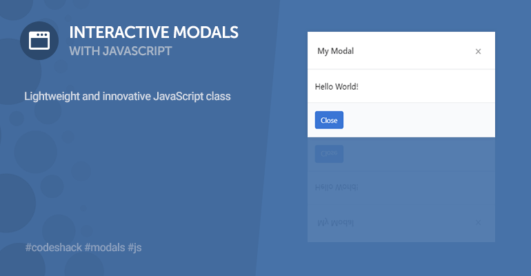
The interactive modal JS class will enable you to seamlessly implement modals on your website, whether it be a confirmation, alert, or prompt modal. Dynamically create and autogenerate modals with minimal configuration.
The JS class is lightweight and designed to be incorporated into any website. There are no third-party dependencies required, such as jQuery or Bootstrap.
Contents
1. Introduction
Modals appear above the content on a website and are usually triggered with user interactivity, for example, when the user clicks a button. In addition, they deactivate all other page content when they're open and the user must engage with the modal to return to the page content.
You can use the class to replace the native popup boxes in JS, which are not user-friendly in modern web apps. There are methods that will enable you to create confirmation, alert, and prompt boxes, with minimal lines of code.
2. Stylesheet (CSS3)
The stylesheet will structure our modals and give them an elegant look.
modal.css
.modal {
  width: 100%;
  height: 100%;
  background-color: rgba(0, 0, 0, 0.5);
  position: fixed;
  top: 0;
  left: 0;
  display: none;
  z-index: 999999;
  align-items: center;
  justify-content: center;
}
.modal .container {
  display: flex;
  flex-flow: column;
  background-color: #ffffff;
  box-shadow: 0px 0px 5px 2px rgba(0, 0, 0, 0.03);
}
.modal .container.zoom {
  transform: scale(0.5);
}
.modal .container.slide {
  transform: translateY(-1000px);
}
.modal .container .header {
  display: flex;
  padding: 20px;
  font-weight: 600;
  justify-content: space-between;
  border-bottom: 1px solid #e6e9ec;
  align-items: center;
}
.modal .container .header h1 {
  font-weight: 500;
  color: #4d4d4d;
  padding: 0;
  margin: 0;
}
.modal .container .header button {
  appearance: none;
  border: none;
  background: transparent;
  cursor: pointer;
  font-size: 24px;
  line-height: 24px;
  padding-bottom: 4px;
  cursor: pointer;
  color: #9a9a9a;
}
.modal .container .header button:hover {
  color: #676767;
}
.modal .container .content {
  padding: 20px 15px;
  flex: 1;
}
.modal .container .content .prompt-input input {
  padding: 10px;
  border-radius: 4px;
  border: 1px solid #e6e9ec;
  margin-top: 15px;
  width: 100%;
}
.modal .container .footer {
  border-top: 1px solid #e6e9ec;
  background-color: #f9fafc;
  padding: 15px;
  display: flex;
}
.modal .container .footer button {
  display: inline-flex;
  appearance: none;
  border: none;
  background-color: #3a75d5;
  color: #ffffff;
  border-radius: 4px;
  padding: 7px 12px;
  font-size: 14px;
  margin-right: 7px;
  cursor: pointer;
}
.modal .container .footer button:last-child {
  margin-right: 0;
}
.modal .container .footer button:hover {
  background-color: #326fd3;
}
.modal .container .footer button.alt {
  font-weight: 500;
  background-color: #dadbdd;
  color: #606266;
}
.modal .container .footer button.alt:hover {
  background-color: #d5d6d8;
}
.modal .container .footer button.right {
  margin-left: auto;
}
.modal.small .container {
  width: 400px;
}
.modal.medium .container {
  width: 600px;
}
.modal.large .container {
  width: 900px;
}
.modal.full .container {
  width: 100%;
  height: 100%;
}
.modal.open {
  display: flex;
}
.modal.open .container.zoom {
  transform: scale(1);
  transition: all 0.2s ease;
}
.modal.open .container.slide {
  transform: translateY(0);
  transition: all 0.5s ease;
}
In the above stylesheet, we leverage transitions to create an animation effect when the modal opens (zoom, slide, etc). It will give the user a better experience when interacting with the modals.
3. JavaScript Class
The JS class will enable you to create an unlimited number of modals and leverage the popup methods that I've implemented that can replace the native browser popup boxes.
modal.js
class Modal {
constructor(options) {
let defaults = { element: null, effect: 'zoom', state: 'closed', size: 'medium', content: null, footer: null, header: null, title: null };
this.options = Object.assign(defaults, options);
if (this.options.element == null) {
this.options.element = document.createElement('div');
this.options.element.classList.add('modal');
this.options.element.innerHTML = `
<div class="container">
<div class="header">
<button class="close">×</button>
</div>
<div class="content"></div>
<div class="footer">
<button class="close">Close</button>
</div>
</div>
`;
document.body.appendChild(this.options.element);
}
this.options.element.querySelector('.container').classList.remove('zoom', 'slide');
this.options.element.querySelector('.container').classList.add(this.options.effect);
if (this.options.header != null) {
this.header = this.options.header;
}
if (this.options.content != null) {
this.content = this.options.content;
}
if (this.options.footer != null) {
this.footer = this.options.footer;
}
if (this.options.title != null) {
this.title = this.options.title;
}
this.size = this.options.size;
this._eventHandlers();
}
open() {
this.options.state = 'open';
this.options.element.style.display = 'flex';
this.options.element.getBoundingClientRect();
this.options.element.classList.add('open');
if (this.options.onOpen) {
this.options.onOpen(this);
}
}
close() {
this.options.state = 'closed';
this.options.element.classList.remove('open');
this.options.element.style.display = 'none';
if (this.options.onClose) {
this.options.onClose(this);
}
}
get state() {
return this.options.state;
}
get effect() {
return this.options.effect;
}
set effect(value) {
this.options.effect = value;
this.options.element.querySelector('.container').classList.remove('zoom', 'slide');
this.options.element.querySelector('.container').classList.add(value);
}
get size() {
return this.options.size;
}
set size(value) {
this.options.size = value;
this.options.element.classList.remove('small', 'large', 'medium', 'full');
this.options.element.classList.add(value);
}
get content() {
return this.options.element.querySelector('.content').innerHTML;
}
get contentElement() {
return this.options.element.querySelector('.content');
}
set content(value) {
if (!value) {
this.options.element.querySelector('.content').remove();
} else {
if (!this.options.element.querySelector('.content')) {
this.options.element.querySelector('.container').insertAdjacentHTML('afterbegin', `<div class="content"></div>`);
}
this.options.element.querySelector('.content').innerHTML = value;
}
}
get header() {
return this.options.element.querySelector('.header').innerHTML;
}
get headerElement() {
return this.options.element.querySelector('.header');
}
set header(value) {
if (!value) {
this.options.element.querySelector('.header').remove();
} else {
if (!this.options.element.querySelector('.header')) {
this.options.element.querySelector('.container').insertAdjacentHTML('afterbegin', `<div class="header"></div>`);
}
this.options.element.querySelector('.header').innerHTML = value;
}
}
get title() {
return this.options.element.querySelector('.header .title') ? this.options.element.querySelector('.header .title').innerHTML : null;
}
set title(value) {
if (!this.options.element.querySelector('.header .title')) {
this.options.element.querySelector('.header').insertAdjacentHTML('afterbegin', `<h1 class="title"></h1>`);
}
this.options.element.querySelector('.header .title').innerHTML = value;
}
get footer() {
return this.options.element.querySelector('.footer').innerHTML;
}
get footerElement() {
return this.options.element.querySelector('.footer');
}
set footer(value) {
if (!value) {
this.options.element.querySelector('.footer').remove();
} else {
if (!this.options.element.querySelector('.footer')) {
this.options.element.querySelector('.container').insertAdjacentHTML('beforeend', `<div class="footer"></div>`);
}
this.options.element.querySelector('.footer').innerHTML = value;
}
}
_eventHandlers() {
this.options.element.querySelectorAll('.close').forEach(element => {
element.onclick = event => {
event.preventDefault();
this.close();
};
});
}
static initElements() {
document.querySelectorAll('[data-modal]').forEach(element => {
element.addEventListener('click', event => {
event.preventDefault();
let modalElement = document.querySelector(element.dataset.modal);
let modal = new Modal({ element: modalElement });
for (let data in modalElement.dataset) {
if (modal[data]) {
modal[data] = modalElement.dataset[data];
}
}
modal.open();
});
});
}
static confirm(value, success, cancel) {
let modal = new Modal({ content: value, header: '', footer: '<button class="success">OK</button><button class="cancel alt">Cancel</button>' });
modal.footerElement.querySelector('.success').onclick = event => {
event.preventDefault();
if (success) success();
modal.close();
};
modal.footerElement.querySelector('.cancel').onclick = event => {
event.preventDefault();
if (cancel) cancel();
modal.close();
};
modal.open();
}
static alert(value, success) {
let modal = new Modal({ content: value, header: '', footer: '<button class="success">OK</button>' });
modal.footerElement.querySelector('.success').onclick = event => {
event.preventDefault();
if (success) success();
modal.close();
};
modal.open();
}
static prompt(value, def, success, cancel) {
let modal = new Modal({ header: '', footer: '<button class="success">OK</button><button class="cancel alt">Cancel</button>' });
modal.content = value + `<div class="prompt-input"><input type="text" value="${def}" placeholder="Enter your text..."></div>`;
modal.footerElement.querySelector('.success').onclick = event => {
event.preventDefault();
if (success) success(modal.contentElement.querySelector('.prompt-input input').value);
modal.close();
};
modal.footerElement.querySelector('.cancel').onclick = event => {
event.preventDefault();
if (cancel) cancel(modal.contentElement.querySelector('.prompt-input input').value);
modal.close();
};
modal.open();
}
}You can use pure HTML to create modals as opposed to dynamically creating them with JS. I will show you how in the next section.
4. How to Use
In this section, I'll provide examples of how you can use the modal class.
4.1. Autogenerate Modals
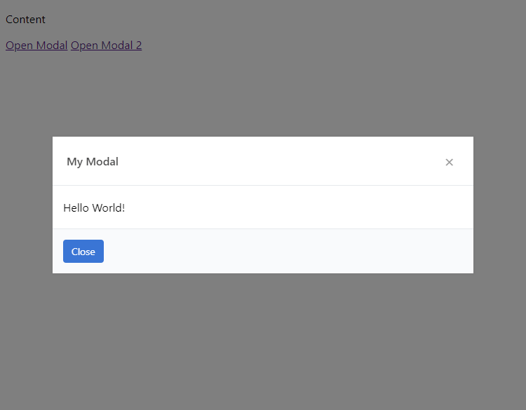
The following HTML code will create two new modals and anchor links to open them:
<a href="#" data-modal=".myModal">Open Modal</a>
<a href="#" data-modal=".myModal2">Open Modal 2</a>
<div class="modal myModal">
<div class="container">
<div class="header">
<h1>My Modal</h1>
<button class="close">×</button>
</div>
<div class="content">
Hello World!
</div>
<div class="footer">
<button class="close">Close</button>
</div>
</div>
</div>
<div class="modal myModal2" data-effect="slide">
<div class="container">
<div class="header">
<h1>My Modal 2</h1>
<button class="close">×</button>
</div>
<div class="content">
Content for modal 2.
</div>
</div>
</div>To initialize these modals, you need to execute the following JS method:
Modal.initElements();Which you can do at the end of the document (before the body closing tag):
<script src="modal.js"></script>
<script>Modal.initElements();</script>
When you click the Open Modal button, you should see the following:
4.2. Dynamic Modals
To create dynamic modals, you need to create a new instance of the Modal class:
const myModal = new Modal({
    effect: 'zoom', // zoom|slide
    size: 'small', // small|medium|large|full
    title: 'Dynamic Modal',
    content: '<p>The content for your dynamic modal.</p>',
    onOpen: function() {
        console.log('modal open');
    },
    onClose: function() {
        console.log('modal closed');
    }
});
You can customize with modal options as seen in the code example above. The onOpen and onClose functions are event handlers for the modal.
To open the modal, you can do:
myModal.open();And to close the modal, you can do:
myModal.close();Or you can attach a button element to the modal with the class close.
You can also update the modal content like so:
myModal.content = 'New Content';
myModal.title = 'New Title';
myModal.footer = '<button class="close">New Button</button>';
To add an existing modal in the DOM, you can specify the element option when declaring a new instance:
const myModal = new Modal({
    element: document.querySelector('.myModal')
});
4.3. Confirmation Modal
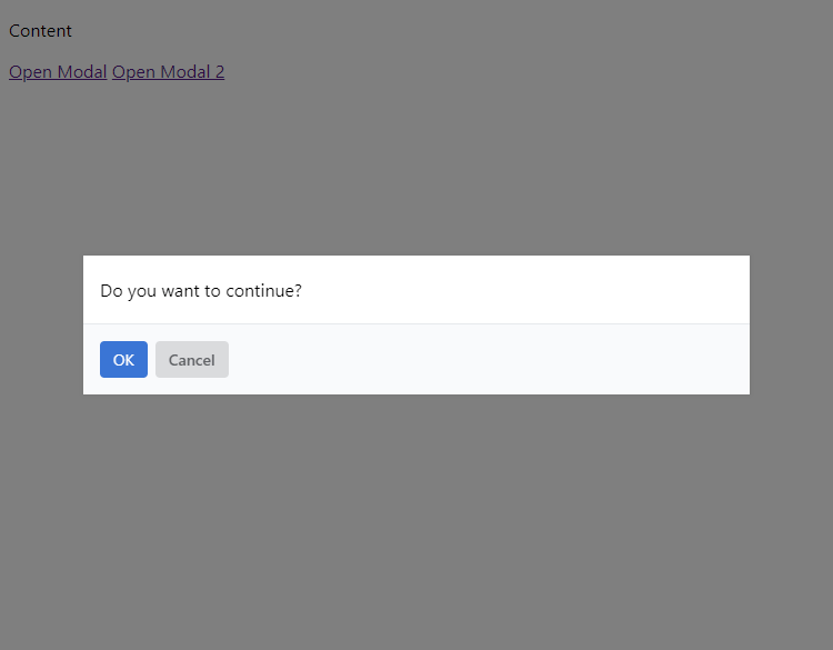
To create a new confirmation modal, you can do:
Modal.confirm('Do you want to continue?', () => {
    console.log('OK');
}, () => {
    console.log('Cancel');
});
There is no need to create a new instance of the class as these are static methods.
The confirmation modal will look like the following:
4.4. Alert Modal
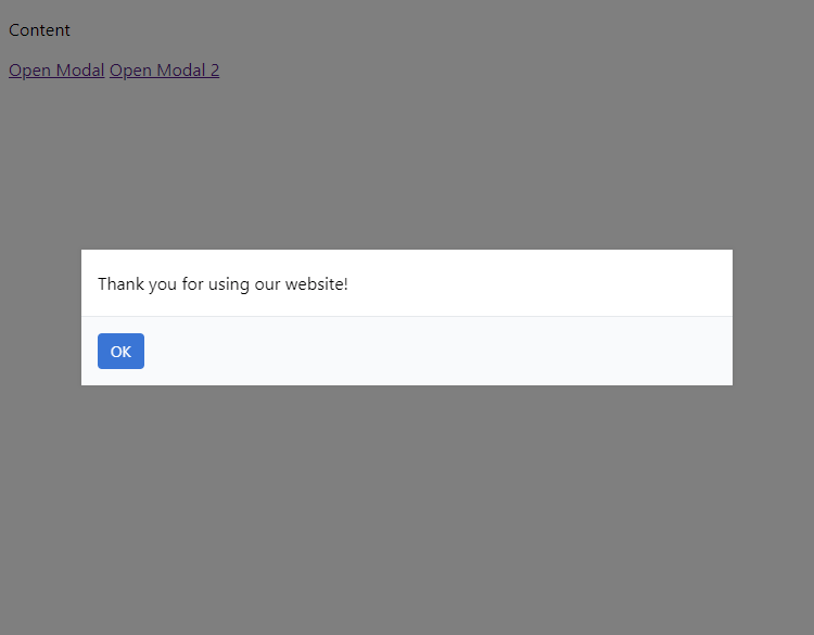
You can create a new alert modal with the following:
Modal.alert('Thank you for using our website!');Which will look like the following:
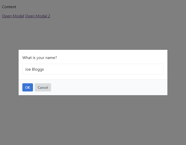
4.5. Prompt Modal
To create a new prompt modal (which will allow user input), you can do:
Modal.prompt('What is your name?', 'Joe Bloggs', value => {
    console.log(value);
});
Which will look like the following:
Conclusion
If you have any suggestions or feedback regarding the modal class, drop a comment below. Share the article on social media using the buttons below as it will help us create more quality content.
Released under the MIT license. Attribution would be appreciated but is not essential.