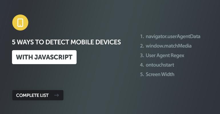
In this tutorial, we'll go through 5 different methods we can use to detect mobile devices with JavaScript (JS), including modern and legacy implementations or a combination for increased reliability.
To this date, most JS libraries are still leveraging the legacy regex method to detect mobile devices, which scans the user agent for keywords like Android or iPhone. While this works fine for most use cases, there are better solutions to use in modern web development. The better solution would be to use the Client Hints API and fallback to a legacy method for devices that do not support this API.
1. The Modern Standard Solution: navigator.userAgentData
This is the most reliable method because it asks the browser directly, "Are you a mobile device?" using the modern Client Hints API. It avoids messy string parsing.
const isMobile = () => {
  // Check if the new API is supported
  if (navigator.userAgentData) {
    return navigator.userAgentData.mobile;
  }

  // Fallback for Safari/Firefox (see Solution 3)
  return /Mobi|Android/i.test(navigator.userAgent);
};

if (isMobile()) {
  console.log("Mobile device detected via Client Hints");
}
The only con to this solution is that, as of writing this article, only Chromium browsers are supported, while browsers like Safari and Firefox have yet to implement this API. It's an experimental feature.
However, we can use a combination of the Client Hints API and the legacy regex solution for a much more reliable solution than using either one alone.
2. The Behavioral Solution: window.matchMedia
This method uses CSS media queries to detect the capabilities of the device rather than its name. Specifically, checking for pointer: coarse identifies devices where the primary input is inaccurate (like a finger on a touchscreen), which almost always corresponds to mobile usage.
const isMobileLike = () => {
  // coarse pointer indicates a touch screen (finger)
  // fine pointer indicates a mouse/trackpad
  return window.matchMedia("(pointer: coarse)").matches;
};

if (isMobileLike()) {
  console.log("Touch interface detected (likely mobile)");
}
While you might think that this is a great solution, there is one drawback: more devices, such as laptops are starting to adopt touchscreen technology, so this solution may become unreliable in the future.
3. The Legacy Solution: User Agent Regex
This involves scanning the userAgent string (a line of text the browser sends to identify itself) for keywords like Android or iPhone. This has been the standard for over a decade. Most JS libraries are still utilizing this solution for mobile detection.
const isMobileUserAgent = () => {
  return /Android|webOS|iPhone|iPad|iPod|BlackBerry|IEMobile|Opera Mini/i.test(navigator.userAgent);
};

if (isMobileUserAgent()) {
  console.log("Mobile User Agent detected");
}
The only issue is that the string can easily be spoofed (faked) by users. It is messy to maintain as new devices are released. However, I highly suggest using this solution as a fallback solution as opposed to using it as a standalone solution. It will help improve reliability across devices.
4. The Touch Event Solution: ontouchstart
This method checks if the device supports touch events. To do that, we can check if the ontouchstart event exists in the window object.
const isTouchDevice = () => {
  return (('ontouchstart' in window) || (navigator.maxTouchPoints > 0));
};

if (isTouchDevice()) {
  console.log("Touch capabilities detected");
}
But is it reliable? Not exactly. Many modern Windows laptops (like the Surface) and some desktops have touchscreens, which can incorrectly identify those full-sized computers as mobile devices.
5. The Naive Solution: Screen Width
This method simply assumes that if the screen is small, it must be a phone. It's easy to understand, but definitely not recommended for accurate mobile detection. If you aren't concerned about accuracy, then this solution may work for you.
const isSmallScreen = () => {
  return window.innerWidth <= 768;
};

if (isSmallScreen()) {
  console.log("Small screen detected");
}
It's the least reliable solution because a user can simply resize their desktop browser window to be narrow, and this code will think they are on a phone. Conversely, high-resolution mobile devices might report large pixel widths depending on the viewport settings, so use this solution with caution.
Conclusion
While no single method is perfect due to browser inconsistencies, we can combine the techniques we've discussed to create a robust mobile detection solution. However, I highly recommend prioritizing navigator.userAgentData if available (it's the future standard).
Personally, I would use a combination of solutions 1 (Client Hints API) and 3 (Regex) for reliable mobile detection.
If you've enjoyed reading this article, please share and drop a comment below with your own solutions.
Enjoy coding, and thanks for reading!