Want to add that cool, staggered grid look to your website, like the ones you see on Pinterest or photo blogs? That's called a masonry layout, and it's a really neat way to show off items of different heights. The great part? You can build your own responsive masonry grid using just HTML, CSS, and a little bit of JavaScript.
This tutorial is designed for beginners and will guide you through each step to get it working!
We have used a similar technique in our advanced gallery system, which is a PHP-based gallery system that allows you to create a responsive masonry layout for your images. You can check it out for more advanced features and functionalities.
So, What's a Masonry Layout?
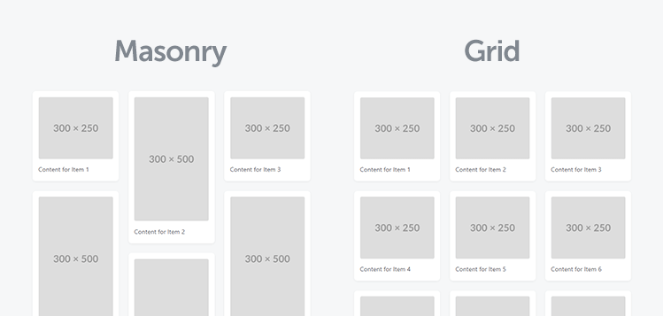
Think of a stonemason building a wall. They fit stones of various sizes together, trying to make everything look neat and minimize gaps. A masonry layout on a webpage does something similar with your content blocks - like images, blog post previews, or portfolio items
Instead of forcing everything into strict rows where all items have the same height, masonry arranges items into columns. New items are typically added to the column that's currently the shortest, creating an attractive, flowing look.
At some point, we'll be able to use grid-template-rows: masonry; to handle masonry layouts, but the browser support for this is still limited. So, for now, we need to rely on a combination of CSS and JavaScript to achieve this effect.
1. The HTML Foundation: Structuring Your Grid
First things first, we need to set up the basic HTML for our masonry grid. The core idea is to have a main container (.masonry-layout) and then, within that, several column divs (.masonry-column). The actual content items (.masonry-item) will initially be placed inside these columns. Our JavaScript will then intelligently rearrange these items when the screen size changes.
Here's what the HTML for a three-column layout looks like:
<div class="masonry-layout">
    <div class="masonry-column">
        <!-- Items for column 1 -->
    </div>
    <div class="masonry-column">
        <!-- Items for column 2 -->
    </div>
    <div class="masonry-column">
        <!-- Items for column 3 -->
    </div>
</div>
Inside each .masonry-column, you'll place your .masonry-item elements. Each item should have a data-sort-index attribute. This is important because our JavaScript will use this index to decide the order of items, especially when switching to the mobile (single-column) view, and how to redistribute them back into columns on wider screens.
An individual item might look like this:
<div class="masonry-item" data-sort-index="1">
    <img src="https://placehold.co/300x250" width="300" height="250" alt="Placeholder Image 1">
    <p>Content for Item 1</p>
</div>
Make sure your images have different heights to really showcase the masonry effect! The data-sort-index should be unique for each item and typically sequential (1, 2, 3, etc.) to define a clear order.
2. The CSS: Making it Look Good and Work
Next, let's add some CSS to style our responsive masonry layout. We'll use Flexbox to arrange the .masonry-column divs side-by-side and give our items some basic styling. This CSS is designed to be simple and effective.
body {
    font-family: system-ui, "Segoe UI", Roboto, Helvetica, Arial, sans-serif, "Apple Color Emoji", "Segoe UI Emoji", "Segoe UI Symbol";
    margin: 60px;
    background-color: #f6f7f8;
}
.masonry-layout {
    display: flex;
    flex-wrap: wrap; /* Allows items to wrap into new rows */
    gap: 25px; /* Space between columns */
    width: 100%; /* Full width of the container */
    max-width: 1000px; /* Optional: limit the width of the layout */
    margin: 0 auto; /* Center the layout */
}
.masonry-column {
    flex: 1; /* Allows columns to grow and shrink */
    min-width: 200px; /* Minimum width before columns might wrap or stack */
    display: flex; /* For items within the column */
    flex-direction: column; /* Stack items vertically in a column */
    gap: 25px; /* Space between items within a column */
}
.masonry-item {
    background-color: #fff;
    padding: 15px;
    border-radius: 8px;
    box-shadow: 0 2px 5px rgba(0,0,0,0.05);
}
.masonry-item img {
    max-width: 100%;
    height: auto; /* Maintain aspect ratio */
    border-radius: 4px;
    display: block; /* Remove extra space below image */
    margin-bottom: 10px;
}
.masonry-item p {
    margin: 15px 0 5px 0;
    font-size: 16px;
    color: #5e6168;
}
Let's break this down:
.masonry-layout: This is our main wrapper. We usedisplay: flexto make its children (the columns) sit side-by-side. Thegapproperty adds space between these columns..masonry-column: Each column is also a flex container (display: flex) but withflex-direction: columnso its children (the items) stack vertically.flex: 1allows columns to share space equally..masonry-item: This styles the individual content blocks with a background, padding, and a subtle shadow.
This CSS provides a clean, multi-column layout for wider screens. The JavaScript will handle adjusting this for smaller screens.
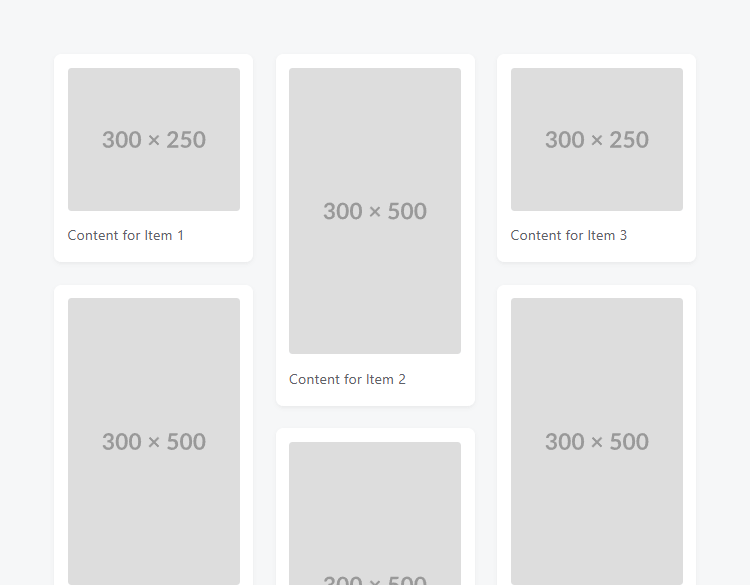
Here's how it looks on a desktop screen:
3. The JavaScript: Making it Smart and Responsive
- On small screens (below a defined breakpoint), take all items out of their columns and stack them directly in the main
.masonry-layoutcontainer, ordered by theirdata-sort-index. - On larger screens, redistribute the items back into the
.masonry-columndivs, again using thedata-sort-indexto determine which column an item goes into (using a round-robin approach). - Listen for window resize events to automatically switch between these two views.
Now for the exciting part - the JavaScript! This code is what makes our masonry grid truly responsive.
Here's the JavaScript. You'll typically place this in a script tag at the bottom of your HTML body.
const sortMasonry = () => {
    const breakpoint = 800; // Set your breakpoint for mobile/desktop switch (800px in this case)
    const container = document.querySelector('.masonry-layout');
    if (!container) return;
    const columnElements = Array.from(container.querySelectorAll('.masonry-column'));
    const numColumns = columnElements.length;
    if (window.innerWidth < breakpoint) {
        // --- MOBILE VIEW ---
        // Check if we need to switch to mobile (e.g., first column is visible and not already processed)
        let needsFlattening = false;
        if (numColumns > 0 && columnElements[0].style.display !== 'none') {
            // Check if items are actually in columns
            for (const col of columnElements) {
                if (col.querySelector('.masonry-item')) {
                    needsFlattening = true;
                    break;
                }
            }
        }
        if (needsFlattening) {
            const allItems = [];
            // Collect all items from wherever they might be to ensure we get them all
            document.querySelectorAll('.masonry-layout .masonry-item').forEach(item => {
                allItems.push(item);
            });
            // Sort items using the data-sort-index attribute
            allItems.sort((a, b) => {
                const indexA = parseInt(a.dataset.sortIndex, 10);
                const indexB = parseInt(b.dataset.sortIndex, 10);
                if (isNaN(indexA) && isNaN(indexB)) return 0;
                if (isNaN(indexA)) return 1;
                if (isNaN(indexB)) return -1;
                return indexA - indexB;
            });
            // Detach all items from their current parents
            allItems.forEach(item => item.remove());
            // Hide and clear original columns
            columnElements.forEach(column => {
                column.innerHTML = '';
                column.style.display = 'none';
            });
            // Append sorted items directly to the main container
            allItems.forEach(item => {
                container.appendChild(item);
            });
        }
    } else {
        // --- DESKTOP VIEW ---
        // Check if we need to switch to desktop (e.g., columns are hidden or items are direct children)
        const itemsAreFlatInContainer = container.querySelector(':scope > .masonry-item');
        if (numColumns > 0 && ((columnElements[0].style.display === 'none') || itemsAreFlatInContainer)) {
            // Prepare columns: make visible and clear.
            // columnMap will use 0-based array index as the key.
            const columnMap = {};
            columnElements.forEach((column, index) => {
                column.style.display = 'flex'; // Or your original display ('block', etc.)
                column.innerHTML = '';
                columnMap[index] = column; // Store column by its 0-based index
            });
            // Collect all .masonry-item elements that have a data-sort-index
            const allItemsToRedistribute = Array.from(document.querySelectorAll('.masonry-layout .masonry-item[data-sort-index]'));
            // Detach all items from their current parents
            allItemsToRedistribute.forEach(item => item.remove());
            // Sort all items globally by their sort-index. This ensures correct distribution order.
            allItemsToRedistribute.sort((a, b) => {
                const indexA = parseInt(a.dataset.sortIndex, 10);
                const indexB = parseInt(b.dataset.sortIndex, 10);
                if (isNaN(indexA) && isNaN(indexB)) return 0;
                if (isNaN(indexA)) return 1;
                if (isNaN(indexB)) return -1;
                return indexA - indexB;
            });
            // Distribute items to columns in a round-robin fashion
            if (numColumns > 0) {
                allItemsToRedistribute.forEach(item => {
                    const sortIndex = parseInt(item.dataset.sortIndex, 10);
                    if (isNaN(sortIndex)) {
                        // Fallback for items without a valid sort-index, append to the first column or container
                        if (columnMap[0]) {
                            columnMap[0].appendChild(item);
                        } else {
                            container.appendChild(item);
                        }
                        return;
                    }
                    // Calculate target column index (0-based)
                    // Assumes data-sort-index is 1-based (1, 2, 3...)
                    const targetColumnIndex = (sortIndex - 1) % numColumns;
                    const targetColumn = columnMap[targetColumnIndex];
                    if (targetColumn) {
                        targetColumn.appendChild(item);
                    } else {
                        // This case should ideally not happen if numColumns > 0 and calculation is correct
                        container.appendChild(item);
                    }
                });
            } else {
                // If there are no columns, append all items to the container
                allItemsToRedistribute.forEach(item => container.appendChild(item));
            }
        }
    }
};
// Debounced resize listener and initial call
let resizeTimer;
window.addEventListener('resize', () => {
    clearTimeout(resizeTimer);
    resizeTimer = setTimeout(sortMasonry, 250);
});
sortMasonry(); // Call on page load
A quick rundown of the JavaScript:
sortMasonry(): The main function that does all the work.breakpoint: You can change this pixel value (e.g., `768`) to decide when the layout switches between mobile (single column) and desktop (multi-column) views.- Mobile View Logic: If the window width is less than the breakpoint, it checks if the items need to be "flattened" (taken out of columns). If so, it gathers all
.masonry-itemelements, sorts them using theirdata-sort-index, hides the original column divs, and appends the sorted items directly to the main.masonry-layoutcontainer. - Desktop View Logic: If the window width is at or above the breakpoint, it checks if items need to be put back into columns. If so, it makes the column divs visible, gathers all items, sorts them globally by
data-sort-index, and then distributes them into the columns in a round-robin fashion based on their sorted order (e.g., item 1 to col 1, item 2 to col 2, item 3 to col 3, item 4 to col 1 again, etc.). - Event Listener: The script also listens for the `resize` event. When you resize your browser window, it calls `sortMasonry()` again (with a slight delay, known as "debouncing", to avoid running the function too many times while resizing). It also calls `sortMasonry()` once when the page first loads to set up the correct initial layout.
Here's how it looks on a mobile screen:
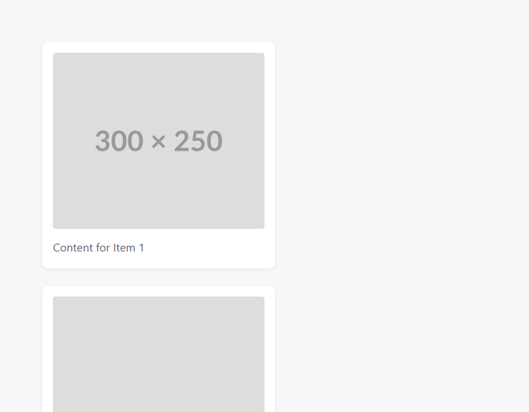
Items will stack vertically in a single column, ordered by their data-sort-index. This is a great way to ensure that your content is still accessible and easy to read on smaller screens.
Understanding This Masonry Approach
This particular way of creating a responsive masonry grid is quite clever for its simplicity. Instead of complex JavaScript calculations to determine the shortest column for each item dynamically (which true masonry libraries do), this method relies on:
- CSS Flexbox for the basic multi-column structure on wider screens.
- Pre-defined item order using `data-sort-index` which you set in your HTML.
- JavaScript to conditionally dismantle the columns for a single-column mobile view, and then intelligently re-populate the columns for desktop view using your `data-sort-index` to guide distribution.
The "round-robin" distribution into columns on desktop (item 1 to col 1, item 2 to col 2, item 3 to col 3, item 4 to col 1...) is a common and effective way to achieve a balanced masonry look without overly complex logic, especially when paired with items of varying heights. This makes it a great technique for those learning about JavaScript DOM manipulation and responsive design.
Where Can You Use This?
A masonry layout is incredibly versatile! Here are a few common scenarios where it really shines:
- Image Galleries: Fantastic for displaying photos of different shapes and sizes. Each
.masonry-itemwould primarily feature animgtag. - Blog Archives/Teasers: Showcasing recent articles with a featured image, title, and a short snippet. The different lengths of text will naturally lead to varied item heights.
- Portfolio Displays: Ideal for designers, photographers, or artists to present thumbnails of their work along with brief descriptions.
For instance, a blog post item in your masonry grid might look like this in your HTML:
<div class="masonry-item" data-sort-index="5">
    <img src="https://placehold.co/300x180" width="300" height="180" alt="Featured image for blog post">
    <h3>My Latest Amazing Article</h3>
    <p>A brief intro to the topic, encouraging users to click and read more...</p>
    <a href="#">Read Full Post</a>
</div>
Full Example Code (HTML, CSS, JS)
Here's the complete code for the responsive masonry layout. You can save this as an HTML file (e.g., masonry.html) and open it in your browser to see it in action.
<!DOCTYPE html>
<html>
    <head>
        <title>Responsive Masonry Layout</title>
        <meta charset="utf-8">
        <meta name="viewport" content="width=device-width,minimum-scale=1">
        <meta name="description" content="Responsive Masonry Layout Tutorial">
        <style>
        body {
            font-family: system-ui, "Segoe UI", Roboto, Helvetica, Arial, sans-serif, "Apple Color Emoji", "Segoe UI Emoji", "Segoe UI Symbol";
            margin: 60px;
            background-color: #f6f7f8;
        }
        .masonry-layout {
            display: flex;
            flex-wrap: wrap; /* Allows items to wrap into new rows */
            gap: 25px; /* Space between columns */
            width: 100%; /* Full width of the container */
            max-width: 1000px; /* Optional: limit the width of the layout */
            margin: 0 auto; /* Center the layout */
        }
        .masonry-column {
            flex: 1; /* Allows columns to grow and shrink */
            min-width: 200px; /* Minimum width before columns might wrap or stack */
            display: flex; /* For items within the column */
            flex-direction: column; /* Stack items vertically in a column */
            gap: 25px; /* Space between items within a column */
        }
        .masonry-item {
            background-color: #fff;
            padding: 15px;
            border-radius: 8px;
            box-shadow: 0 2px 5px rgba(0,0,0,0.05);
        }
        .masonry-item img {
            max-width: 100%;
            height: auto; /* Maintain aspect ratio */
            border-radius: 4px;
            display: block; /* Remove extra space below image */
            margin-bottom: 10px;
        }
        .masonry-item p {
            margin: 15px 0 5px 0;
            font-size: 16px;
            color: #5e6168;
        }
        /* Basic responsiveness for smaller screens (handled more by JS) */
        /* Our JS will effectively make it a single column below the breakpoint */
        </style>
	</head>
	<body>
        <div class="masonry-layout">
            <div class="masonry-column">
                <div class="masonry-item" data-sort-index="1">
                    <img src="https://placehold.co/300x250" width="300" height="250" alt="Placeholder Image 1">
                    <p>Content for Item 1</p>
                </div>
                <div class="masonry-item" data-sort-index="4">
                    <img src="https://placehold.co/300x500" width="300" height="500" alt="Placeholder Image 4">
                    <p>Content for Item 4</p>
                </div>
                <div class="masonry-item" data-sort-index="7">
                    <img src="https://placehold.co/300x500" width="300" height="500" alt="Placeholder Image 7">
                    <p>Content for Item 7</p>
                </div>
            </div>
            <div class="masonry-column">
                <div class="masonry-item" data-sort-index="2">
                    <img src="https://placehold.co/300x500" width="300" height="500" alt="Placeholder Image 2">
                    <p>Content for Item 2</p>
                </div>
                <div class="masonry-item" data-sort-index="5">
                    <img src="https://placehold.co/300x500" width="300" height="500" alt="Placeholder Image 5">
                    <p>Content for Item 5</p>
                </div>
                <div class="masonry-item" data-sort-index="8">
                    <img src="https://placehold.co/300x250" width="300" height="250" alt="Placeholder Image 8">
                    <p>Content for Item 8</p>
                </div>
            </div>
            <div class="masonry-column">
                <div class="masonry-item" data-sort-index="3">
                    <img src="https://placehold.co/300x250" width="300" height="250" alt="Placeholder Image 3">
                    <p>Content for Item 3</p>
                </div>
                <div class="masonry-item" data-sort-index="6">
                    <img src="https://placehold.co/300x500" width="300" height="500" alt="Placeholder Image 6">
                    <p>Content for Item 6</p>
                </div>
                <div class="masonry-item" data-sort-index="9">
                    <img src="https://placehold.co/300x500" width="300" height="500" alt="Placeholder Image 9">
                    <p>Content for Item 9</p>
                </div>
            </div>
        </div>
        <script>
        const sortMasonry = () => {
            const breakpoint = 800; // Set your breakpoint for mobile/desktop switch (800px in this case)
            const container = document.querySelector('.masonry-layout');
            if (!container) return;
            const columnElements = Array.from(container.querySelectorAll('.masonry-column'));
            const numColumns = columnElements.length;
            if (window.innerWidth < breakpoint) {
                // --- MOBILE VIEW ---
                // Check if we need to switch to mobile (e.g., first column is visible and not already processed)
                let needsFlattening = false;
                if (numColumns > 0 && columnElements[0].style.display !== 'none') {
                    // Check if items are actually in columns
                    for (const col of columnElements) {
                        if (col.querySelector('.masonry-item')) {
                            needsFlattening = true;
                            break;
                        }
                    }
                }
                if (needsFlattening) {
                    const allItems = [];
                    // Collect all items from wherever they might be to ensure we get them all
                    document.querySelectorAll('.masonry-layout .masonry-item').forEach(item => {
                        allItems.push(item);
                    });
                    // Sort items using the data-sort-index attribute
                    allItems.sort((a, b) => {
                        const indexA = parseInt(a.dataset.sortIndex, 10);
                        const indexB = parseInt(b.dataset.sortIndex, 10);
                        if (isNaN(indexA) && isNaN(indexB)) return 0;
                        if (isNaN(indexA)) return 1;
                        if (isNaN(indexB)) return -1;
                        return indexA - indexB;
                    });
                    // Detach all items from their current parents
                    allItems.forEach(item => item.remove());
                    // Hide and clear original columns
                    columnElements.forEach(column => {
                        column.innerHTML = '';
                        column.style.display = 'none';
                    });
                    // Append sorted items directly to the main container
                    allItems.forEach(item => {
                        container.appendChild(item);
                    });
                }
            } else {
                // --- DESKTOP VIEW ---
                // Check if we need to switch to desktop (e.g., columns are hidden or items are direct children)
                const itemsAreFlatInContainer = container.querySelector(':scope > .masonry-item');
                if (numColumns > 0 && ((columnElements[0].style.display === 'none') || itemsAreFlatInContainer)) {
                    // Prepare columns: make visible and clear.
                    // columnMap will use 0-based array index as the key.
                    const columnMap = {};
                    columnElements.forEach((column, index) => {
                        column.style.display = 'flex'; // Or your original display ('block', etc.)
                        column.innerHTML = '';
                        columnMap[index] = column; // Store column by its 0-based index
                    });
                    // Collect all .masonry-item elements that have a data-sort-index
                    const allItemsToRedistribute = Array.from(document.querySelectorAll('.masonry-layout .masonry-item[data-sort-index]'));
                    // Detach all items from their current parents
                    allItemsToRedistribute.forEach(item => item.remove());
                    // Sort all items globally by their sort-index. This ensures correct distribution order.
                    allItemsToRedistribute.sort((a, b) => {
                        const indexA = parseInt(a.dataset.sortIndex, 10);
                        const indexB = parseInt(b.dataset.sortIndex, 10);
                        if (isNaN(indexA) && isNaN(indexB)) return 0;
                        if (isNaN(indexA)) return 1;
                        if (isNaN(indexB)) return -1;
                        return indexA - indexB;
                    });
                    // Distribute items to columns in a round-robin fashion
                    if (numColumns > 0) {
                        allItemsToRedistribute.forEach(item => {
                            const sortIndex = parseInt(item.dataset.sortIndex, 10);
                            if (isNaN(sortIndex)) {
                                // Fallback for items without a valid sort-index, append to the first column or container
                                if (columnMap[0]) {
                                    columnMap[0].appendChild(item);
                                } else {
                                    container.appendChild(item);
                                }
                                return;
                            }
                            // Calculate target column index (0-based)
                            // Assumes data-sort-index is 1-based (1, 2, 3...)
                            const targetColumnIndex = (sortIndex - 1) % numColumns;
                            const targetColumn = columnMap[targetColumnIndex];
                            if (targetColumn) {
                                targetColumn.appendChild(item);
                            } else {
                                // This case should ideally not happen if numColumns > 0 and calculation is correct
                                container.appendChild(item);
                            }
                        });
                    } else {
                        // If there are no columns, append all items to the container
                        allItemsToRedistribute.forEach(item => container.appendChild(item));
                    }
                }
            }
        };
        // Debounced resize listener and initial call
        let resizeTimer;
        window.addEventListener('resize', () => {
            clearTimeout(resizeTimer);
            resizeTimer = setTimeout(sortMasonry, 250);
        });
        sortMasonry(); // Call on page load
        </script>
    </body>
</html>
Conclusion & What's Next?
Congratulations! You've now built a functional and responsive masonry layout using HTML, CSS, and JavaScript. This is a fantastic skill to have for creating more engaging and visually dynamic web pages. You've seen how to structure the HTML, style it with Flexbox, and use JavaScript to intelligently rearrange content based on screen size.
From here, you could explore:
- More Columns: Try adding a fourth or fifth
.masonry-columnin your HTML and see how the JavaScript distributes items. - Different Breakpoints: Adjust the
breakpointvalue in the JavaScript to fine-tune when your layout switches. - Loading Content Dynamically: If you're working with PHP or another backend language, you can generate the
.masonry-itemelements from a database. - Dedicated Libraries: For very complex needs, animations, or advanced filtering, check out established JavaScript libraries like Masonry.js or Isotope.
We hope this tutorial on building a CSS and JavaScript masonry grid has been helpful. Happy coding, and enjoy your new layout skills!